21 Living Room Painting Ideas That Add Instant Warmth
You have been staring at the same beige walls for three years. You know they need to change. You just have no idea where to start.
Paint is the highest-return investment you make in any room. A $200 tin of paint and a weekend of work changes how a space looks, feels, and functions. No contractor required. No structural decisions to stress about. Just color, finish, and the confidence to commit.
These 21 living room painting ideas cover every approach, from safe neutrals to bold feature walls, from ceiling treatments to color blocking. Every idea here has a reason to exist.
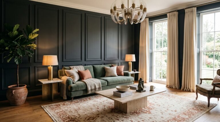
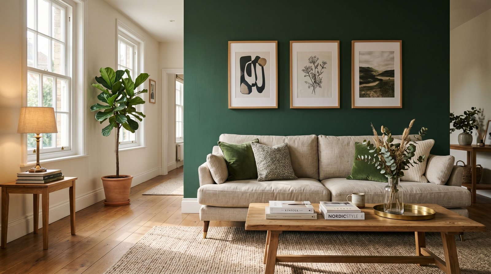
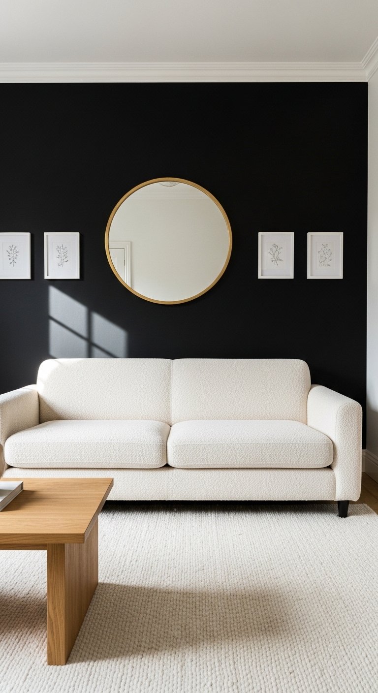
1. Paint One Wall in a Deep, Saturated Color
The feature wall remains one of the most effective living room painting ideas for a reason. It works.
Pick the wall your sofa faces or the wall your fireplace sits on. Paint it in a deep, saturated color. Midnight navy, forest green, burnt ochre, charcoal. Keep the remaining three walls in a complementary neutral.
The result is a room that feels designed rather than defaulted. The deep wall anchors the space and gives every piece of furniture something to sit against with intention.
One important rule: the feature wall color needs to appear somewhere else in the room. A cushion, a rug, a piece of art. Without that repetition, the feature wall looks like an accident rather than a decision.
2. Go All-In With a Dark Color on All Four Walls
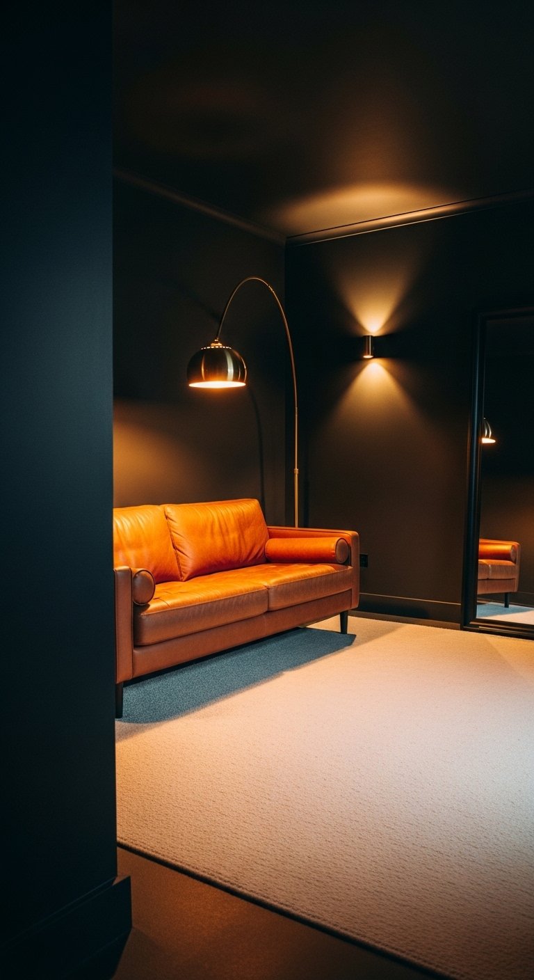
Most people stop at one dark wall. The ones who paint all four walls dark end up with a room they never want to leave.
A living room painted entirely in deep charcoal, dark teal, or inky navy feels immersive and cocooning in a way that no light room achieves. The darkness wraps the space and makes everything inside it feel more deliberate and considered.
This works best in rooms with good artificial lighting and at least one source of natural light. A dark room with no light sources feels like a basement. A dark room with warm lamp light and daylight feels like a private club.
Do not let anyone tell you dark paint makes a small room feel smaller. A small room painted dark feels intimate. A small room painted white feels like a hospital waiting area. IMO, dark paint in a small living room is almost always the better choice.
3. Paint the Ceiling the Same Color as the Walls
Most ceilings are white. Most ceilings are boring. Fix both problems at once.
Painting the ceiling the same color as the walls creates an enveloping, immersive effect that makes the room feel like a complete, intentional space rather than four walls with a white lid slapped on top.
This technique works particularly well with mid-tone colors. Dusty rose, warm sage, terracotta, and soft slate blue all create beautiful enveloping rooms when taken across the ceiling. Deep colors work too but require more commitment and better lighting.
The psychological effect is significant. A color-matched ceiling lowers the perceived height of the room and increases the sense of warmth and enclosure. For a living room where comfort is the goal, that is exactly what you want.
4. Use a Warm White Instead of Bright White
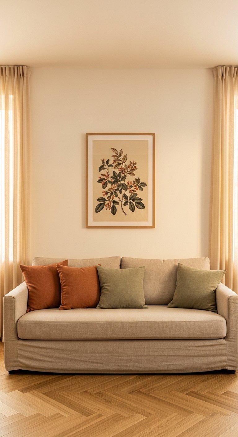
Bright white paint is the default choice for living rooms. It is also frequently the wrong one.
Bright white, particularly whites with a blue or grey undertone, reads as cold and stark in rooms with warm natural light or warm artificial lighting. The white fights the warmth of the light rather than working with it.
Warm whites with yellow, pink, or cream undertones sit comfortably in warm-lit rooms and photograph beautifully. Shades like Farrow and Ball’s All White, Dulux Whisper White, or Benjamin Moore’s White Dove all read as white to the eye while adding warmth to the overall space.
Test paint colors in your specific room before committing. A warm white in a north-facing room with cool light reads completely differently to the same color in a south-facing room with warm afternoon light. Sample pots exist for a reason.
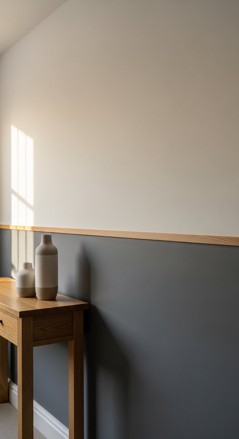
5. Try Color Blocking With Two Tones
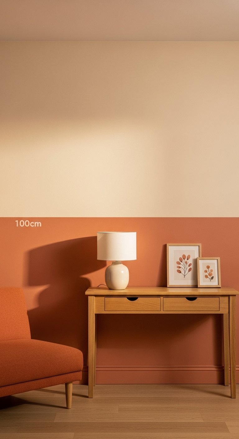
Color blocking divides the wall into two horizontal sections, each painted a different color. The dividing line runs at a fixed height, typically at dado rail height (around 90cm to 110cm from the floor) or at picture rail height.
The lower section takes the darker or more saturated color. The upper section takes the lighter tone. This grounds the room visually and creates a sense of weight and stability that all-one-color walls do not achieve.
Popular color blocking combinations include:
- Terracotta lower, warm cream upper
- Forest green lower, soft white upper
- Navy lower, pale grey upper
- Warm charcoal lower, off-white upper
The dividing line itself becomes a design element. A clean painted line looks sharp and modern. A physical timber or plaster dado rail adds architectural detail at the transition point.
6. Paint the Woodwork in a Contrasting Color
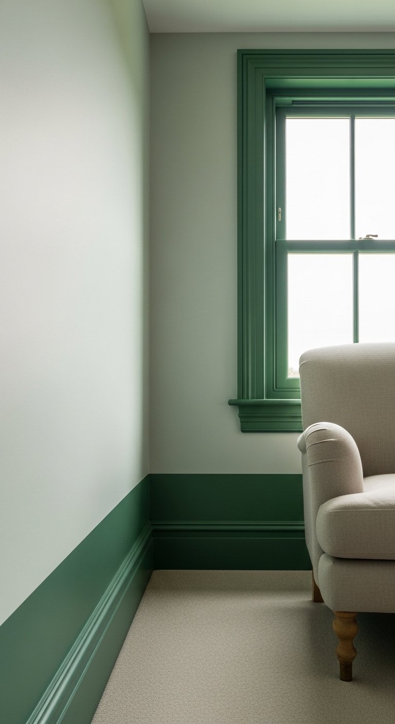
Most people paint their skirting boards, door frames, and window frames in the same color as the walls or in standard white. Painting the woodwork in a contrasting color is a simple move that adds significant visual interest.
Dark walls with white woodwork look sharp and classic. White walls with black or charcoal woodwork look graphic and architectural. Neutral walls with a warm-toned woodwork color add depth without drama.
This approach costs almost nothing extra since you are painting surfaces you were painting anyway. The impact relative to the effort is one of the best ratios in any living room painting project.
Eggshell or satin finish works best on woodwork. It handles cleaning better than matte and does not look as plastic as full gloss in most modern living rooms.
7. Paint an Arch or Architectural Shape on the Wall
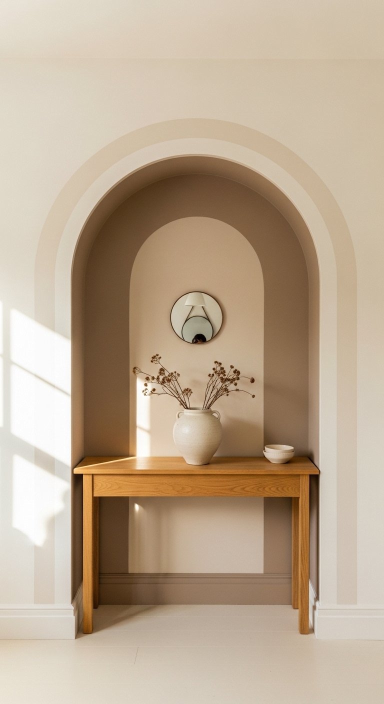
You do not need actual architectural features to paint an arch. You paint the arch directly onto the wall.
A painted arch above a sofa, a fireplace, or a console table creates the visual effect of an alcove or architectural recess without any construction. Use the same wall color but two shades deeper inside the arch shape, or use a completely different color.
This technique photographs extremely well and costs almost nothing. A pencil, a piece of string, and a steady hand give you the arch outline. Tape the edges and paint the interior.
The arch works in both traditional and contemporary living rooms. In a modern minimal room, a clean semicircular arch adds warmth. In a more traditional room, a painted arch reinforces the architectural character already present.
8. Use a Limewash or Textured Paint Finish
Flat paint gives you one dimension. Limewash gives you ten.
Limewash paint creates a layered, aged, slightly uneven finish that adds genuine texture and depth to a wall surface. No two areas of a limewash wall look identical, which gives the room an organic, artisan quality that flat paint never achieves.
Limewash works best in warm, earthy tones. Terracotta, warm white, sandy ochre, dusty rose, and sage green all translate beautifully into a limewash finish. Cool greys and blues are less forgiving in this technique.
The application is more involved than standard paint. Most limewash finishes require two or three coats applied with a brush in overlapping, irregular strokes. The irregularity is the point. Fight the urge to make it even.
9. Paint the Fireplace Surround in a Bold Color
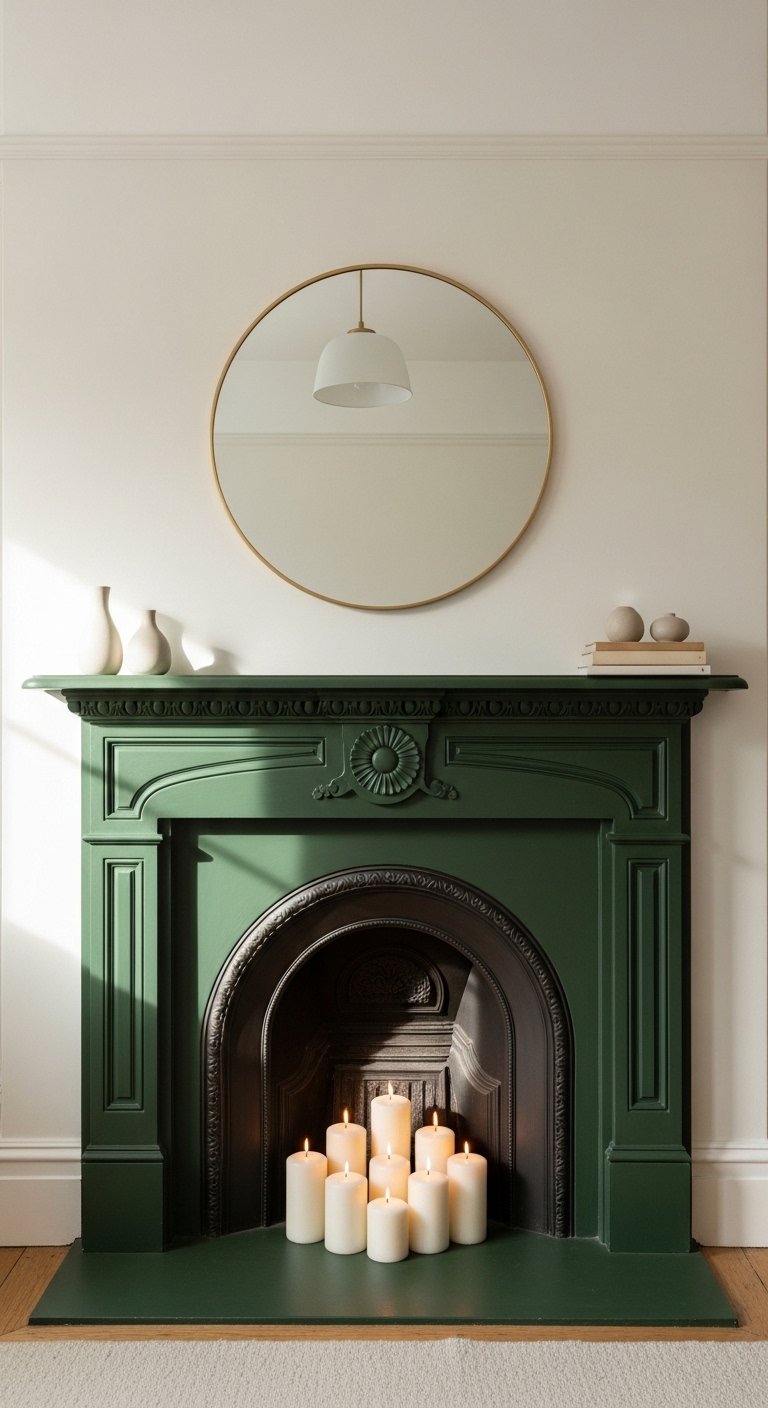
The fireplace is the natural focal point of most living rooms. Painting the surround in a bold color draws attention to it intentionally.
A fireplace surrounded in deep green, navy, terracotta, or black stands out against neutral walls and anchors the room around its natural center point. The surrounding walls stay neutral. The fireplace does the visual work.
This works even in rented properties where you cannot paint the walls. A painted fireplace surround is a small, reversible change that makes a significant visual impact.
Use an eggshell or satin finish on the surround. Matte paint on a fireplace surround shows every fingerprint and scuff within two weeks of painting.
10. Create a Painted Mural or Abstract Wall
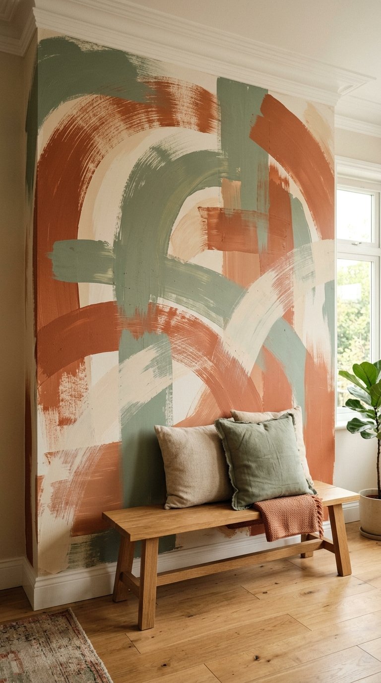
A painted mural on one living room wall is the most personal painting idea on this list. It is also the one most people talk themselves out of.
You do not need to be a professional artist. Abstract murals using large brushstrokes, color washes, and simple geometric shapes require no artistic training. A wide decorating brush, two or three coordinating paint colors, and a loose approach produce results that look intentional and interesting.
The key is committing to the scale. A small, tentative abstract brushstroke on a large wall looks hesitant. Large, confident marks that run from floor to ceiling look designed. Go big or repaint.
If freehand feels too risky, project a simple design onto the wall using a phone projector and trace the outlines before painting. This removes the freehand anxiety entirely.
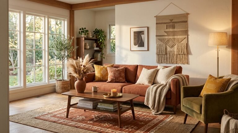
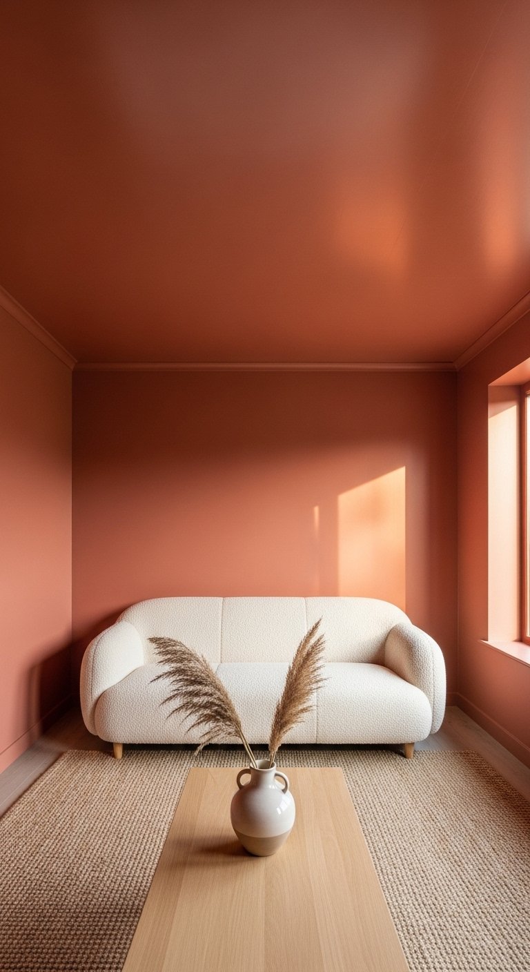
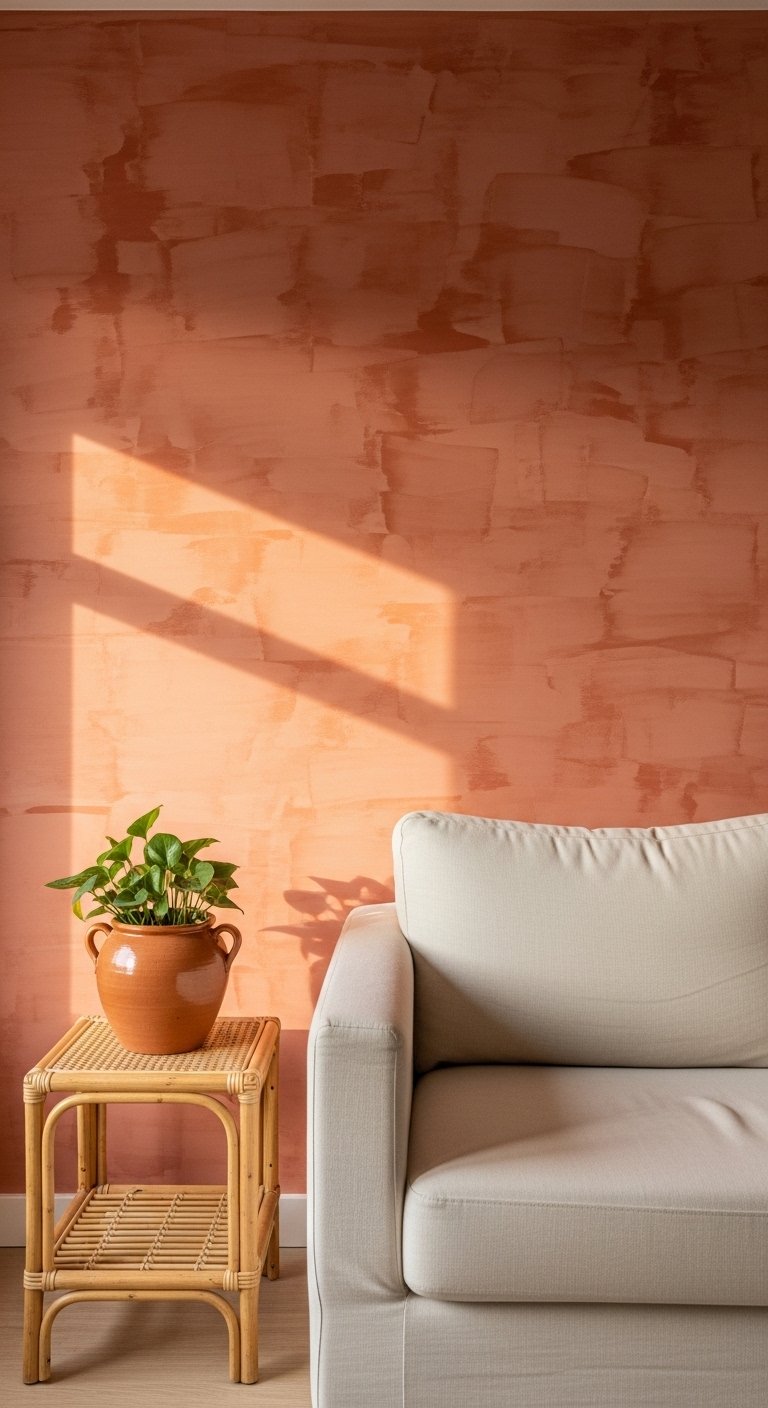
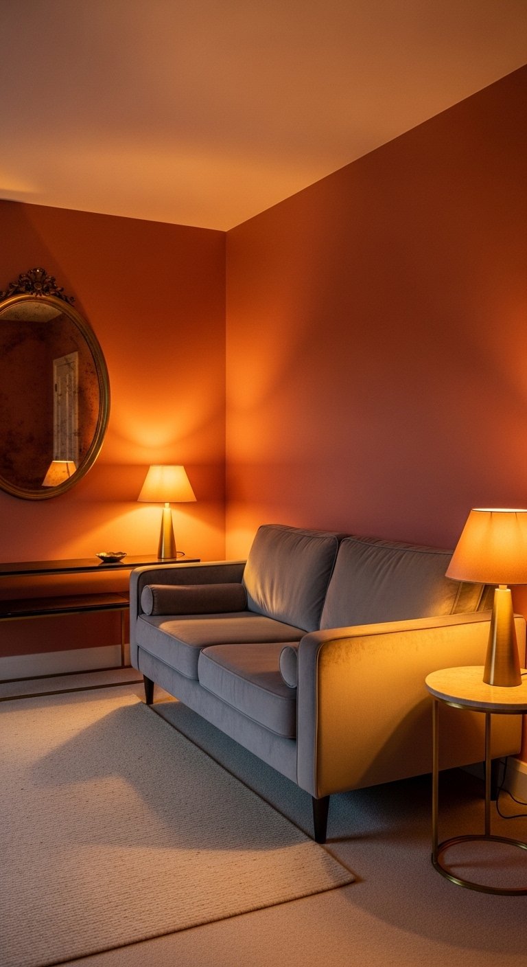
11. Paint in a Warm Terracotta Tone
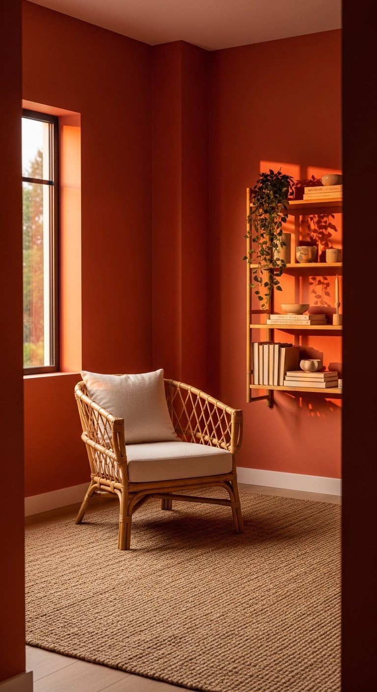
Terracotta has had a sustained run in interior design for good reason. It works in almost every lighting condition and with almost every furniture style.
Warm terracotta tones sit between orange and brown on the color spectrum. They add warmth without the aggression of bright orange and depth without the weight of deep brown. In a living room with warm afternoon light, terracotta walls glow.
Terracotta pairs well with natural materials. Rattan, linen, leather, natural wood, and woven textiles all look more considered against a terracotta background than against a standard neutral.
FYI, terracotta is one of those colors that looks completely different on a paint chip versus on a full wall. Always test a large sample patch before committing. The color deepens significantly at full wall scale.
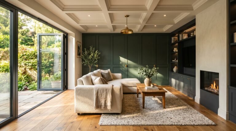
12. Paint in Sage Green
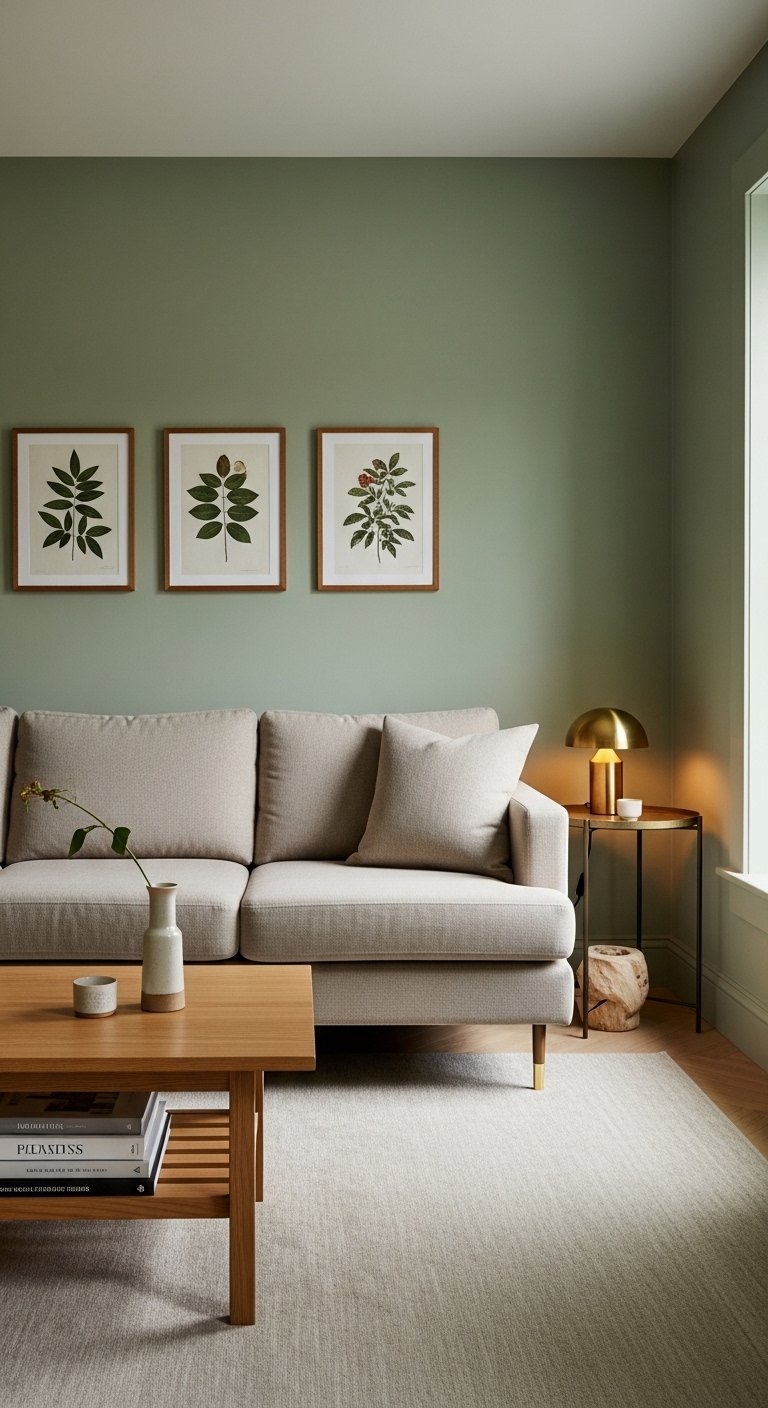
Sage green is one of the most versatile living room paint colors available. It works in traditional, transitional, and contemporary rooms without effort.
Sage green sits between grey and green, which means it reads differently depending on the light in the room. In the warm afternoon light it looks green. In cool morning light it reads closer to grey. This flexibility makes it one of the safest bold color choices for a living room.
Sage green works with warm neutrals, natural wood, brass hardware, and linen textiles better than almost any other color. It also works with white, black, and navy accents, which covers most existing furniture combinations.
Use a matte or flat finish for sage green walls. The slight chalky quality of a matte finish suits the earthy, organic character of the color and makes the room feel calm rather than clinical.
13. Use a Two-Wall Color Scheme in an L-Shaped Room
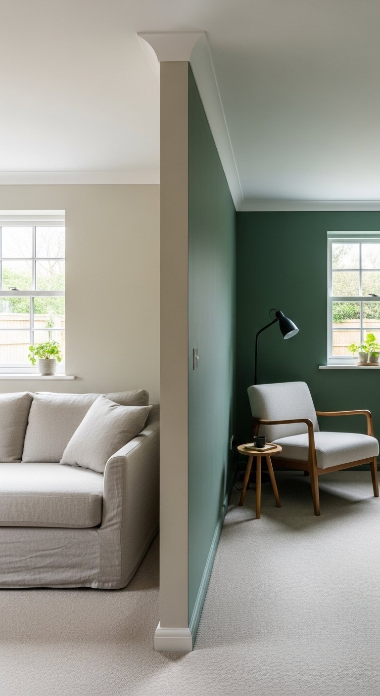
L-shaped living rooms present a painting opportunity that most people miss. The natural break in the room’s geometry gives you a logical place to change color.
Paint the shorter leg of the L in a deeper or more saturated version of the main wall color. The main area stays lighter and more spacious. The shorter section becomes a reading corner, a TV zone, or a dining alcove defined by color rather than walls.
This approach uses color to do the work that furniture arrangement alone cannot do in an awkward L-shaped floor plan. It creates two distinct zones within one room without any construction.
The two colors need to be in the same family. A warm sage green main area with a deeper forest green shorter section works. A warm sage green main area with a completely unrelated navy shorter section creates confusion rather than definition.
14. Paint With a Matte Black Accent
Matte black as a living room accent paint color is more versatile than most people expect.
A single matte black wall in a living room with white or light grey walls creates a graphic, high-contrast effect that looks bold but not aggressive. The black wall recedes visually while simultaneously creating a strong backdrop for art, shelving, and furniture placed against it.
Matte black also works as a ceiling color in a room with high ceilings. A black ceiling with white walls draws the ceiling downward visually, creating a more intimate scale in a room that would otherwise feel cold and cavernous.
Use only true matte finish for black walls. Any sheen on a black wall reveals every roller mark, brush stroke, and surface imperfection. Matte black is forgiving. Satin black is not.
15. Try a Painted Stripe Pattern
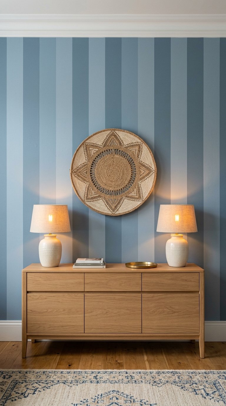
Painted stripes on a living room wall add pattern and visual interest without wallpaper cost or commitment.
Vertical stripes make a room feel taller. Horizontal stripes make a room feel wider. Choose the direction based on what the room actually needs rather than personal preference.
For a subtle effect, use two tones of the same color, one slightly lighter and one slightly darker. The stripe pattern reads as texture rather than bold decoration. For a more graphic effect, use two contrasting colors with a sharp, clean line between them.
Tape is everything with a stripe project. Use a laser level to mark perfectly straight lines before applying tape. A stripe that wanders by even 2mm over a 3 metre wall height looks visibly wrong to the eye.
16. Paint the Alcoves a Different Color
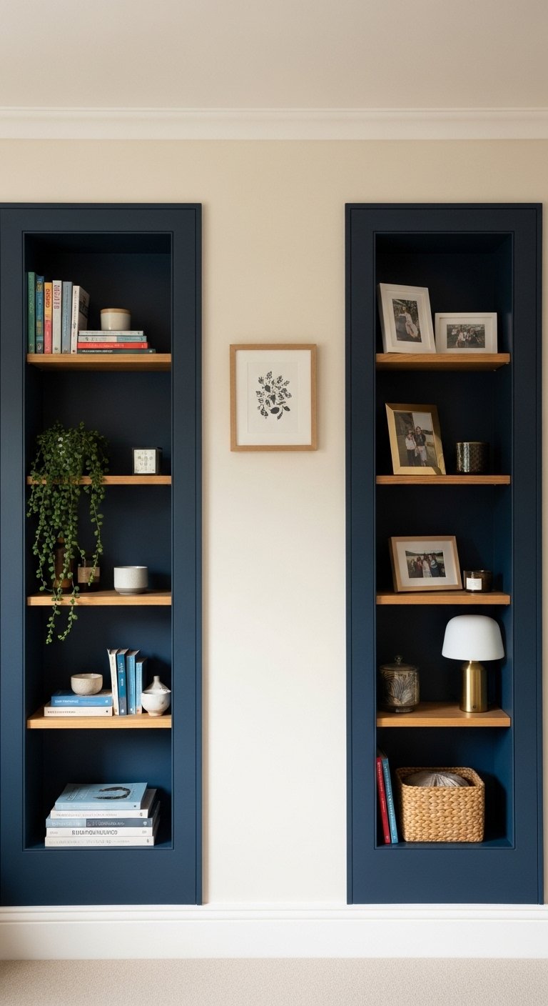
Most living rooms with a chimney breast have alcoves on either side. Most people paint them the same color as the rest of the room. Most people miss an easy opportunity.
Painting the alcove recesses a deeper or more saturated color than the main walls makes them feel intentional and architectural. The alcoves stop being dead wall space and start being designed elements.
This works particularly well when the alcoves hold built-in shelving or cabinetry. Deep green alcoves with white shelving. Navy alcoves with natural wood shelving. Terracotta alcoves with brass-accented shelving. Each combination reads as a considered design decision.
The alcove color does not need to match the fireplace wall or feature wall. It needs to belong to the same overall color story as the rest of the room.
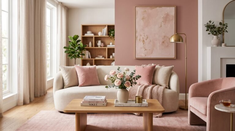
17. Use a Dusty Pink or Blush Tone
Dusty pink and blush tones in a living room work in a way that the word “pink” does not prepare you for.
Dusty pink sits closer to warm terracotta than to candy pink. It reads as a warm neutral in certain light conditions and as a soft, considered color in others. In a living room with warm artificial lighting in the evening, dusty pink walls create a genuinely flattering, warm atmosphere.
Pair dusty pink walls with warm neutrals, natural linen, and brass or warm gold accents for a cohesive result. Avoid cold metals like chrome or cool grey furniture against dusty pink walls. The contrast between warm and cool undermines both.
This is one of those colors that looks far more at home in a finished room than it does on a paint chip. Trust the sample patch more than the chip.
18. Paint the Lower Third of the Wall in a Darker Tone
This is a variation on color blocking that works in almost any room regardless of existing architecture.
Paint the lower 90 to 110cm of the wall in a darker tone. Leave the upper wall and ceiling in a lighter color. Add a thin painted line or a physical timber batten at the transition point to give the division a clean, finished edge.
The darker lower section grounds the room visually and protects the most scuff-prone section of the wall. It also creates a sense of solidity and weight that all-one-color walls in lighter tones often lack.
This technique suits both traditional and contemporary rooms. In a traditional room, it references the historical use of dado rails. In a contemporary room, it reads as a deliberate graphic design decision.
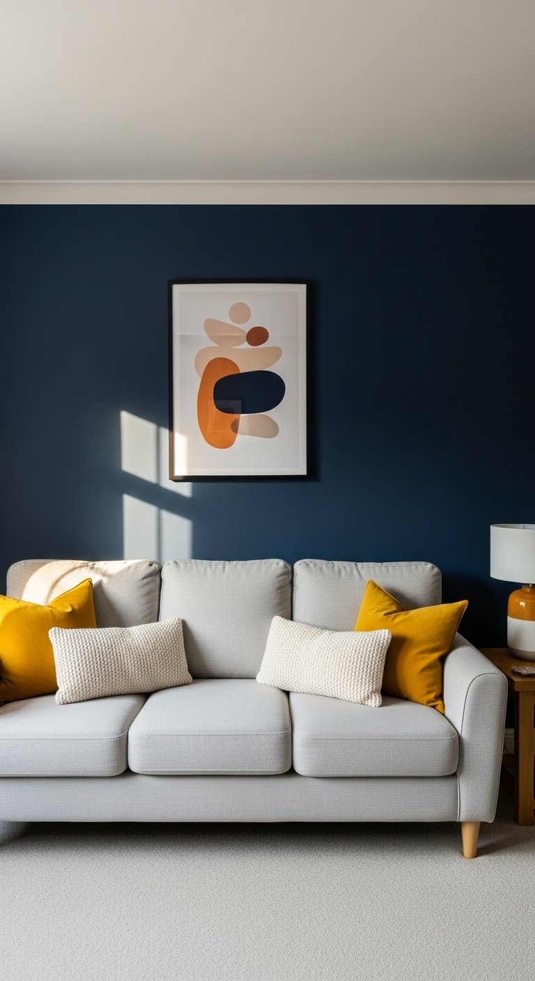
19. Go With a Navy Blue Living Room
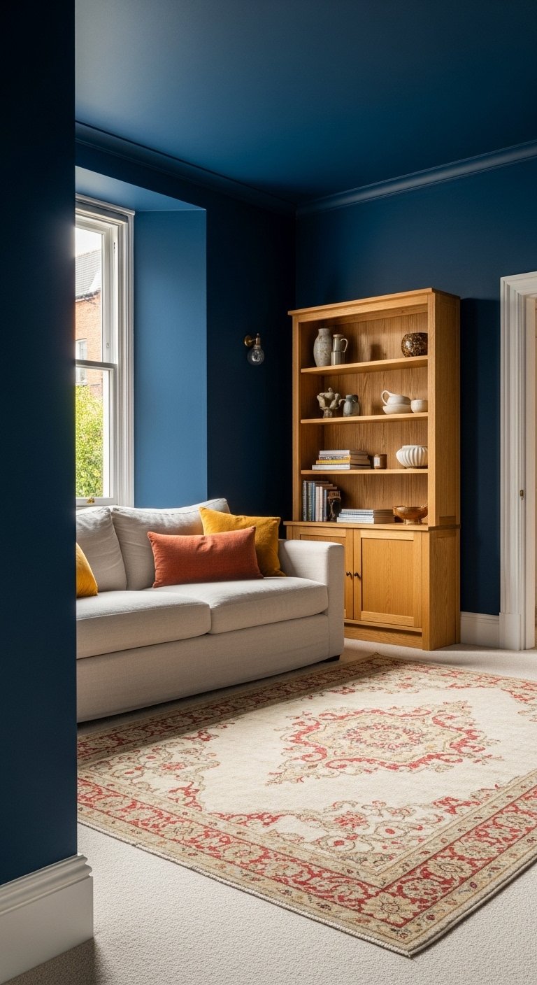
Navy blue is one of those living room paint colors that photographs well, functions well, and ages well. It is hard to get wrong.
Navy walls in a living room create a backdrop that makes warm-toned furniture, natural wood, brass, and cream textiles look more expensive and considered than they do against neutral walls. The depth of the color adds visual richness without requiring expensive furniture or accessories to fill the room.
Navy works in both small and large living rooms. In a small room it creates intimacy. In a large room it adds warmth and reduces the sense of empty space. It is one of the few paint colors that genuinely adapts to the room rather than fighting it.
Pair navy with warm white woodwork rather than cool white. The warm white softens the contrast and keeps the room feeling residential rather than corporate.
20. Paint the Ceiling in a Warm Tone
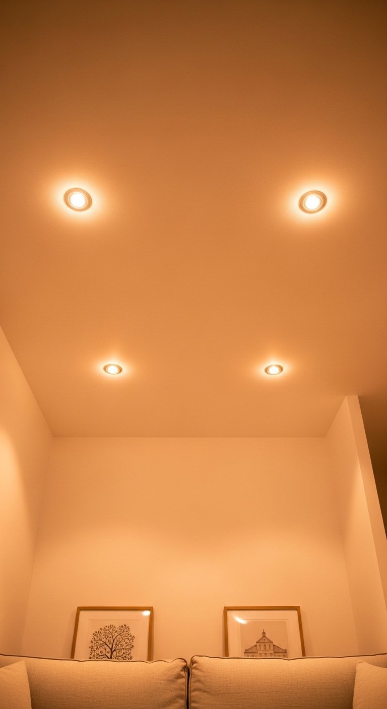
A warm-toned ceiling changes how a room feels at every hour of the day.
Most people treat the ceiling as an afterthought and paint it white by default. A ceiling painted in a warm blush, pale ochre, soft terracotta, or warm peach tone bounces warm light back into the room from above, making the entire space feel warmer and more inviting.
This works especially well in rooms with overhead recessed lighting. The warm-toned ceiling amplifies the warmth of the downlights and creates a glow effect at night that a white ceiling never produces.
The ceiling color does not need to match the walls. It needs to belong to the same warm or cool family as the wall color. A warm terracotta wall with a pale warm ochre ceiling belongs together. A cool sage green wall with a warm peach ceiling fights itself.
21. Commit to an All-White Room Done Properly
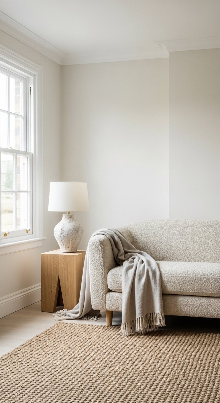
All-white living rooms look effortless in magazines. In reality, they require more thought than any other approach to get right.
An all-white living room that works uses at least three different whites. A warm white on the walls. A slightly cooler white on the ceiling to increase perceived height. A pure white on the woodwork to sharpen the edges and define the architecture.
The mistake most people make with all-white rooms is using one single white everywhere. One white across walls, ceiling, and woodwork reads as flat and unresolved. Three coordinated whites read as considered and layered.
Texture becomes the design tool in an all-white room. Linen cushions, a boucle sofa, a woven rug, rough-textured ceramics, and natural wood all provide the visual interest that color provides in other rooms. Without texture, an all-white living room looks sterile. With it, it looks considered. 🙂
Final Thoughts
A living room paint color is the biggest visual decision you make in the space. It affects every other element in the room, from how the furniture reads to how the light behaves at different times of day.
Start with the decisions that are hardest to reverse. Wall color first. Ceiling treatment second. Woodwork last. Test every color as a large sample patch in the actual room before buying full tins.
You do not need all 21 ideas. You need the two or three that suit your specific room, your specific light, and how you actually use the space. Pick those, commit fully, and stop second-guessing the color at 11pm when the artificial light makes everything look different anyway.
The right paint color does not just change your living room. It changes how you feel every time you walk into it. That is worth getting right.