23 Kitchen Colour Ideas Designers Use for Maximum Impact
You stare at your kitchen cabinets every single day. And if they are the same shade of builder-grade white they were when you moved in, you already know something needs to change.
Kitchen colour is one of the highest-impact, lowest-disruption changes you make to a home. The right colour on the right surface transforms how the kitchen looks, how it feels to cook in, and how the whole ground floor reads as a connected space.
These 23 kitchen colour ideas cover cabinets, walls, islands, ceilings, and the details most people overlook. Every idea here works in a real kitchen, not just in a magazine spread.
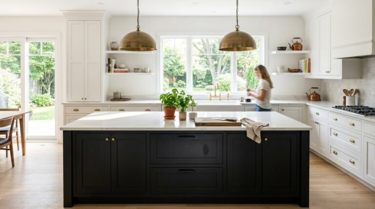
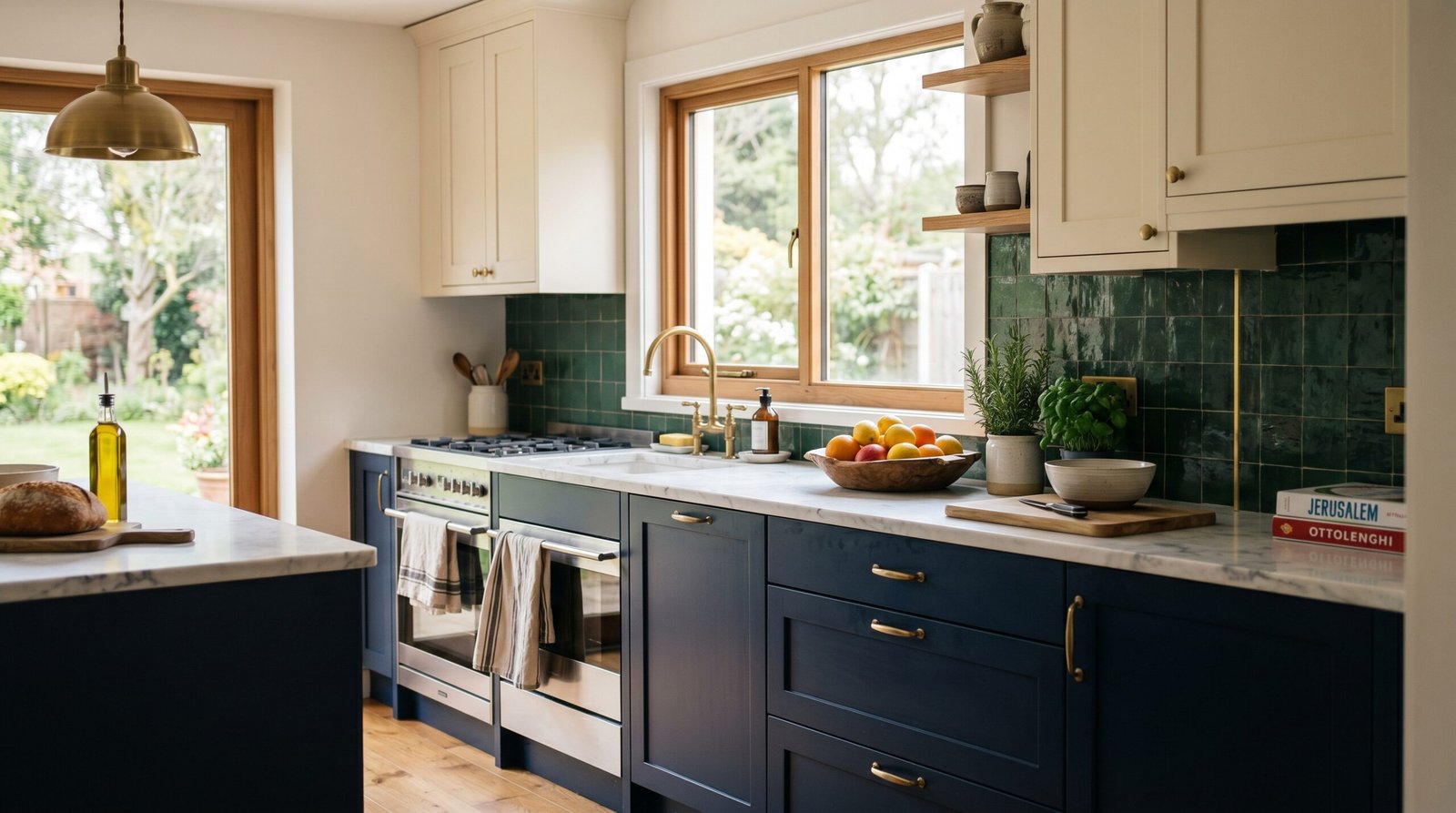
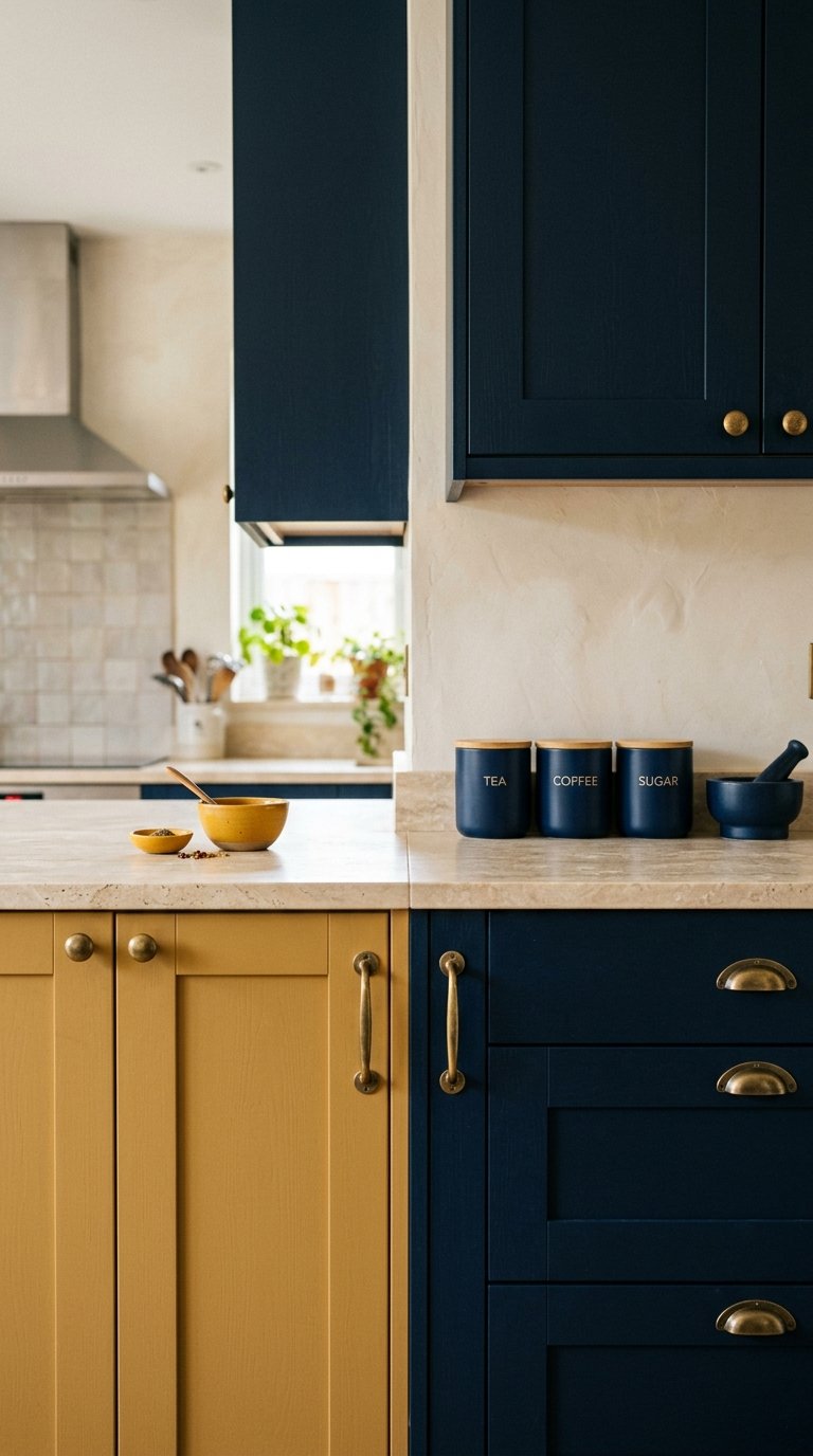
1. Go Deep Navy on the Lower Cabinets
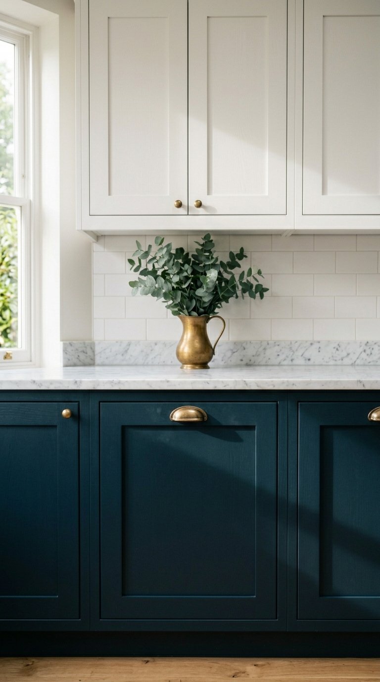
Navy lower cabinets are one of the most consistently successful kitchen colour choices available. They have been popular for a decade and they show no signs of dating.
Deep navy on the lower cabinets paired with white or cream upper cabinets creates a two-tone kitchen that feels designed without being risky. The navy grounds the lower half of the room while the lighter uppers keep the kitchen feeling open and bright.
The Navy works with brass, chrome, and black hardware equally well. It suits both traditional Shaker-style cabinets and more contemporary flat-panel doors. It also hides everyday scuffs and fingerprints better than lighter colours, which is a practical benefit that never gets enough credit.
Pair navy lowers with a white marble or light quartz countertop for the classic combination. Or pair with a warm oak countertop if you want the kitchen to feel warmer and more organic.
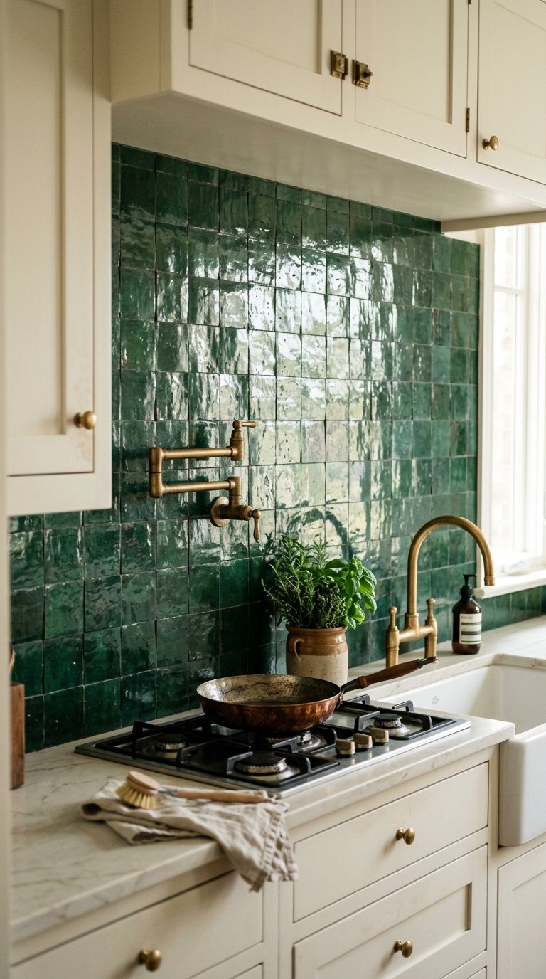
2. Try Forest Green Cabinets
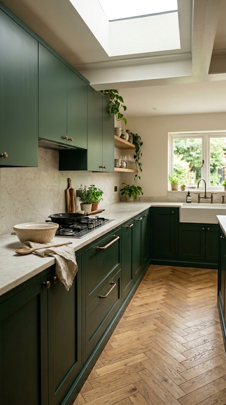
Forest green kitchens photograph beautifully, feel organic and considered, and work in both traditional and contemporary settings.
Deep forest green on all cabinets creates a kitchen that feels rich and botanical without the aggression of a darker colour like black or charcoal. It sits comfortably between neutral and bold, which means it works with a wide range of countertop and flooring materials.
Forest green pairs best with brass or unlacquered bronze hardware. The warm metal tones against the deep green create a combination that looks genuinely high-end without requiring expensive materials elsewhere in the kitchen.
Avoid pairing forest green with cool grey countertops. The cool grey fights the warm, organic quality of the green. Stick to warm whites, natural stone, oak, or warm quartz tones for the surfaces.
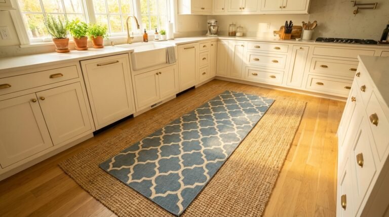
3. Use Warm White on All Cabinets
Warm white kitchens done properly look timeless. Warm white kitchens done lazily look like every rental property built between 2005 and 2015. The difference is in the details.
A warm white with a yellow or cream undertone reads as genuinely white in most lighting conditions while adding a softness and warmth that bright white or cool white does not have. Farrow and Ball’s All White, Little Greene’s Loft White, and Dulux Timeless all sit in this category.
Pair warm white cabinets with warm-toned hardware, a warm-toned countertop, and warm artificial lighting. A warm white kitchen with cool grey countertops, chrome taps, and cool LED lighting fights itself at every surface.
The finish on white cabinets matters significantly. Satin finish handles cleaning better than matte in a kitchen environment and does not show grease marks as readily as high gloss.
4. Paint the Kitchen Island a Contrasting Colour
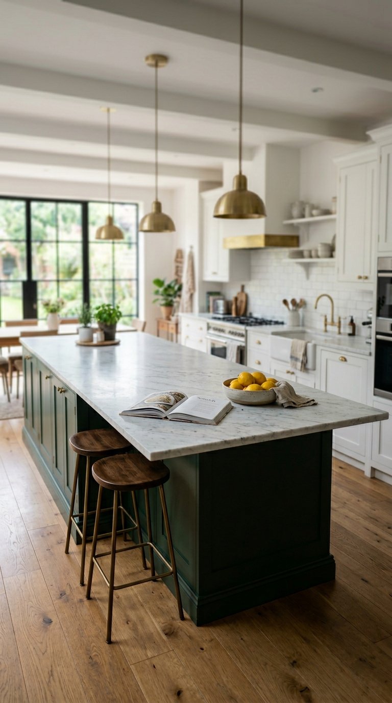
If the thought of painting all your cabinets a bold colour makes you nervous, start with the island. One piece. One decision. Maximum impact with minimum commitment.
A contrasting island colour in a kitchen with neutral cabinets creates a focal point that anchors the room and adds personality without touching the perimeter cabinetry. Deep green island against white perimeter cabinets. Navy island against cream perimeter cabinets. Terracotta island against greige perimeter cabinets.
This approach also gives you a way to test a bold colour at a smaller scale before committing to it across the full kitchen. If you love the island colour, the next repainting project becomes easier to commit to.
The island colour should appear somewhere else in the kitchen or connected living space. A cushion, a plant pot, a piece of art. Without that repetition, the island colour looks isolated rather than intentional.
5. Choose Sage Green for a Calm, Organic Kitchen
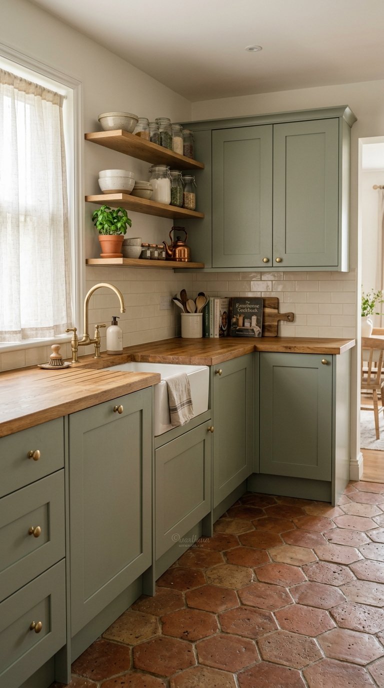
Sage green sits in the sweet spot between neutral and colour. It reads as green in warm light and closer to grey in cool light, which makes it one of the most versatile kitchen colours available.
Sage green on all cabinets creates a kitchen that feels calm, organic, and considered without the boldness of forest green or the visual weight of navy. It suits farmhouse kitchens, Shaker kitchens, and more contemporary flat-panel kitchens equally well.
Sage green works particularly well with natural materials. Butcher block countertops, terracotta tile floors, rattan accessories, and linen textiles all look more considered against sage green than against a standard neutral.
FYI, sage green is one of those colours that looks completely different on a paint chip versus on a full cabinet door. Always test a door or a sample panel in the actual kitchen before committing to the full repaint.
6. Paint the Walls in a Warm Terracotta
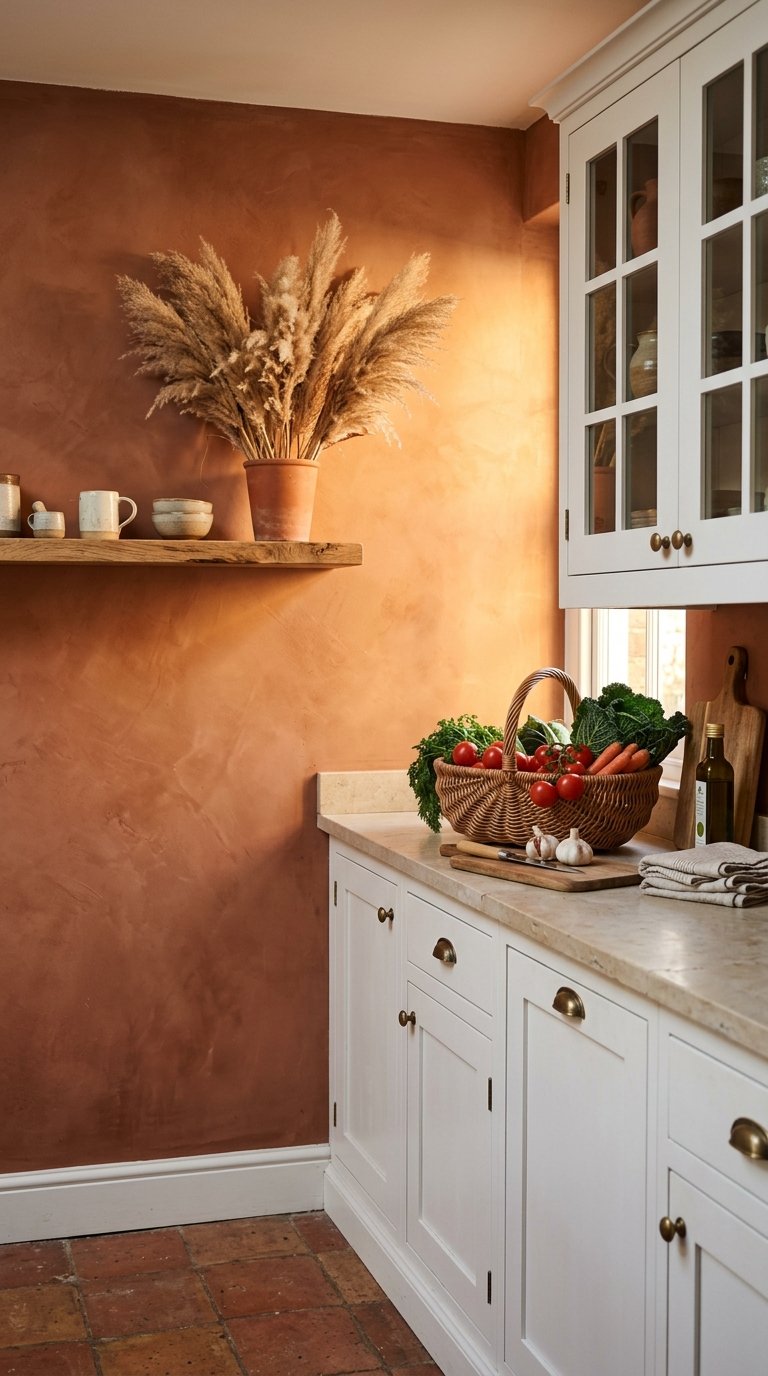
Most people focus kitchen colour decisions entirely on the cabinets. The walls are an equally powerful canvas and they cost a fraction of a cabinet repaint to change.
Warm terracotta on the kitchen walls creates a backdrop that makes white, cream, and natural wood cabinets look warm and considered rather than cold and clinical. The terracotta walls bring the warmth that the cabinetry colour alone cannot provide.
Terracotta walls work particularly well in kitchens with natural stone flooring, rattan or wicker accessories, and warm brass or copper hardware. The earthy quality of the colour connects naturally with organic materials.
This colour also changes dramatically depending on the light. In morning light it reads as a warm peach. In the afternoon light it glows orange-red. In artificial evening light it creates a genuinely warm atmosphere. Test a large sample patch before committing.
7. Use Charcoal Grey on All Cabinets
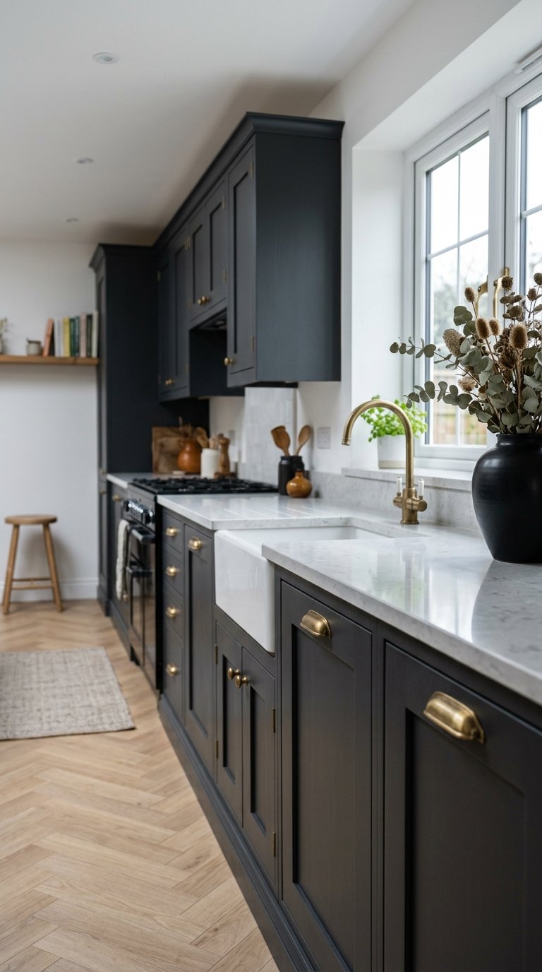
Charcoal grey kitchens occupy the space between the warmth of navy and the drama of black. They feel sophisticated and residential in a way that pure black kitchens sometimes do not.
Charcoal grey works in both matte and satin finishes, each creating a different mood. Matte charcoal feels more contemporary and minimal. Satin charcoal feels more traditional and polished.
Pair charcoal grey cabinets with white or light grey walls to keep the kitchen feeling open. A full charcoal kitchen, cabinets and walls in the same dark tone, requires excellent lighting and a generous floor plan to avoid feeling oppressive.
Brass hardware against charcoal grey is one of the most reliably good combinations in kitchen design. The warm metal against the cool dark grey creates a contrast that reads as intentional and premium.
8. Try a Two-Tone Blue and White Combination
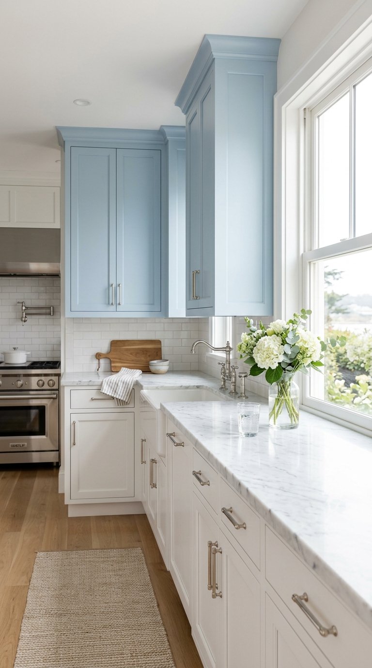
Blue and white kitchens have a longevity that most other colour combinations do not. They read as clean, considered, and timeless across multiple design styles.
Powder blue upper cabinets with crisp white lower cabinets or the reverse creates a soft, friendly kitchen colour scheme that feels designed without being bold. The blue reads as almost neutral in most lighting conditions, which makes it one of the safer bold colour choices available.
This combination suits both traditional and coastal-style kitchens particularly well. Pair with brushed chrome or polished nickel hardware to keep the cool, clean quality of the colour scheme intact.
Avoid warm-toned countertops with powder blue cabinets. The warm countertop fights the cool blue. Stick to white marble, light grey quartz, or pale stone surfaces.
9. Paint the Ceiling a Deep Colour
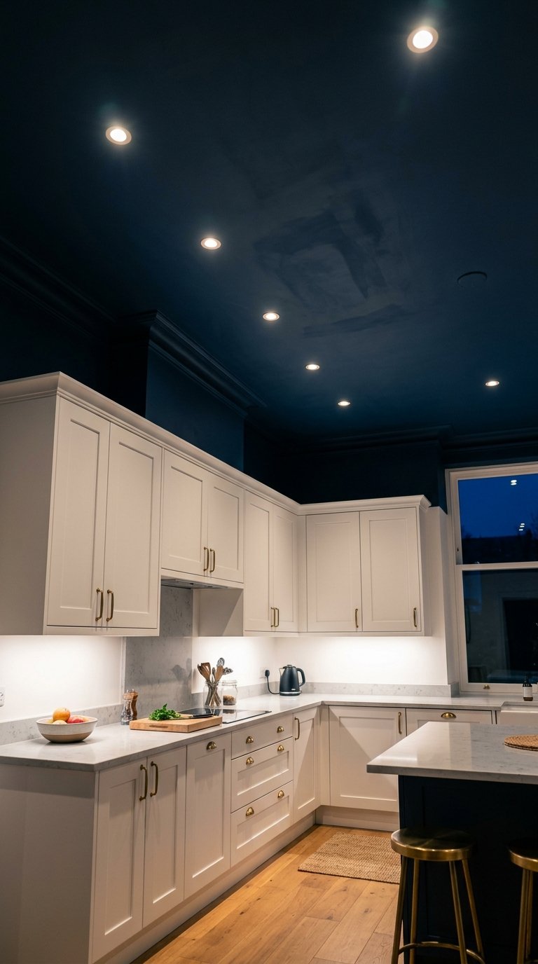
The kitchen ceiling is the most consistently overlooked surface in any colour scheme. Painting it a deep colour while keeping the cabinets and walls lighter creates a dramatic, considered effect that completely changes the room’s atmosphere.
A deep navy, forest green, or charcoal ceiling above white cabinets creates a cocooning effect that makes the kitchen feel designed and purposeful without making it feel dark during the day.
This technique works best in kitchens with good artificial lighting. Recessed downlights that push light downward keep the work surfaces bright while the dark ceiling creates atmosphere above. A dark ceiling with poor lighting just looks like a lighting budget problem.
Extend the ceiling colour down to the top of the cabinets or to picture rail height for a more intentional, architectural effect.
10. Choose Dusty Pink for a Surprising but Sophisticated Kitchen
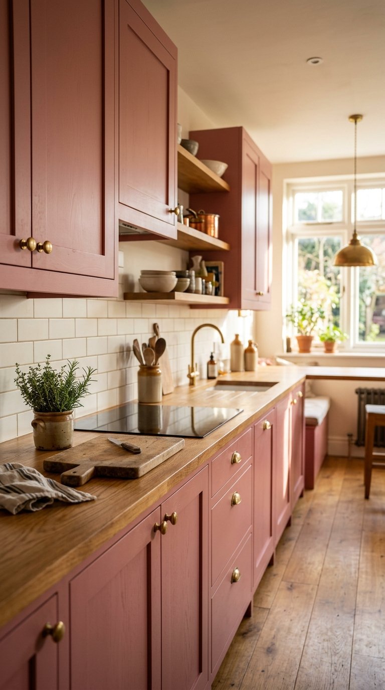
Dusty pink in a kitchen sounds like a decision you would immediately regret. In practice, it creates one of the most surprising and genuinely beautiful kitchen colour schemes available.
Dusty pink sits closer to warm terracotta than to candy pink, which means it reads as a warm neutral in certain lighting conditions. Against white walls, natural wood countertops, and brass hardware, dusty pink cabinets look considered and sophisticated rather than sweet or juvenile.
This colour works best in kitchens with generous natural light. In a north-facing kitchen with limited daylight, dusty pink risks reading as cold rather than warm. In a south or west-facing kitchen with afternoon light, it glows.
Pair dusty pink with unlacquered brass hardware, a natural wood countertop, and white subway tile backsplash. This combination delivers warmth, texture, and organic quality without any single element overpowering the others.
11. Use Black on the Island Only
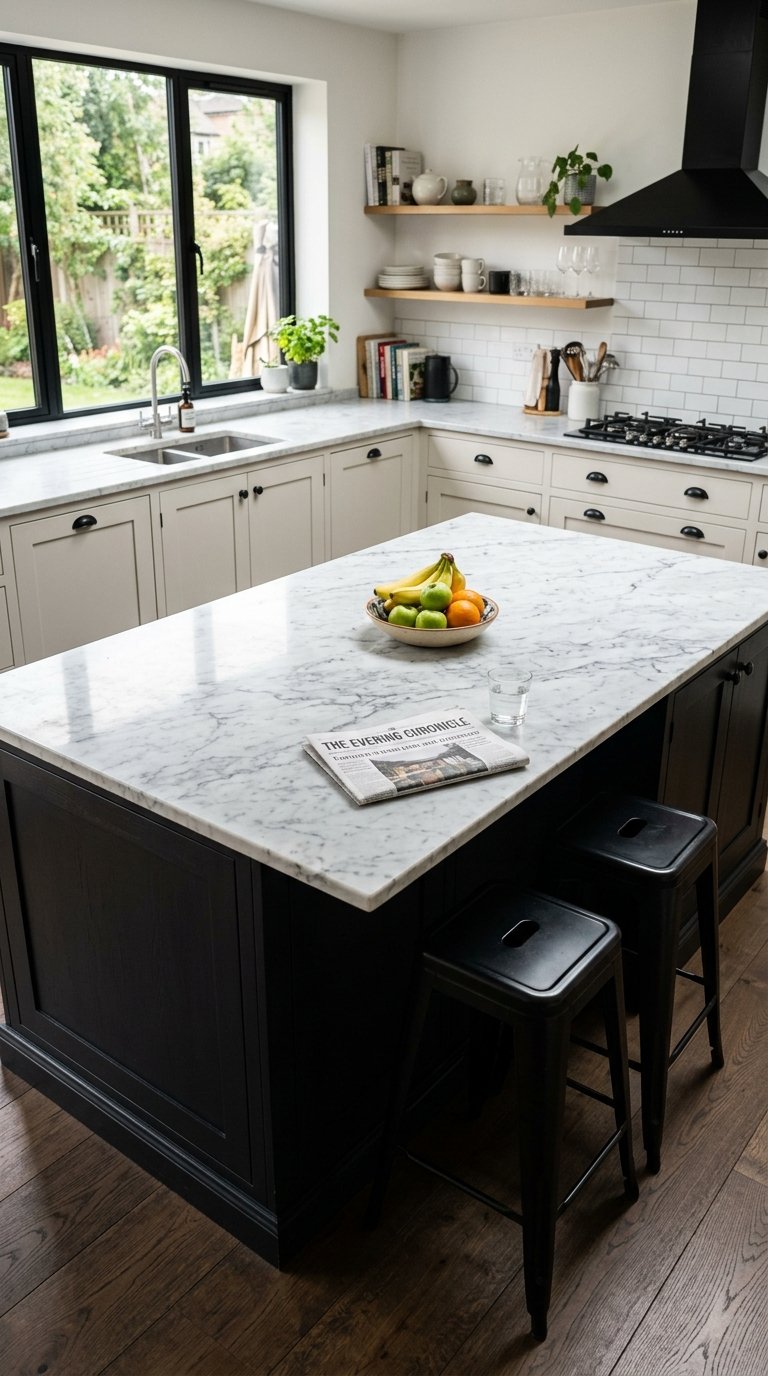
A black kitchen island in a kitchen with lighter perimeter cabinets creates one of the most graphic, high-contrast effects in residential kitchen design.
Matte black on the island base with a white or light marble countertop on top creates a piece that reads as a statement of furniture rather than just a built-in cabinet unit. The contrast is bold but contained, which means it works in kitchens that would not suit all-black cabinetry.
Black hides fingerprints, scuffs, and everyday kitchen marks better than almost any other cabinet colour. On a heavily used surface like an island, this is a significant practical benefit.
Pair a black island with black hardware on the lighter perimeter cabinets to connect the two parts of the kitchen visually. Consistent hardware finish across different cabinet colours creates coherence rather than confusion.
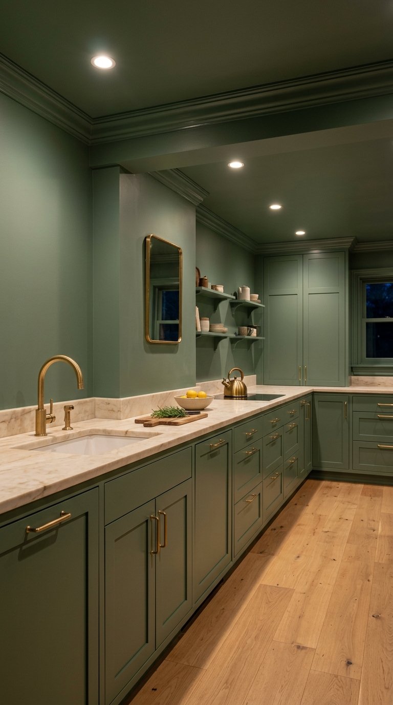
12. Go All-In With Olive Green
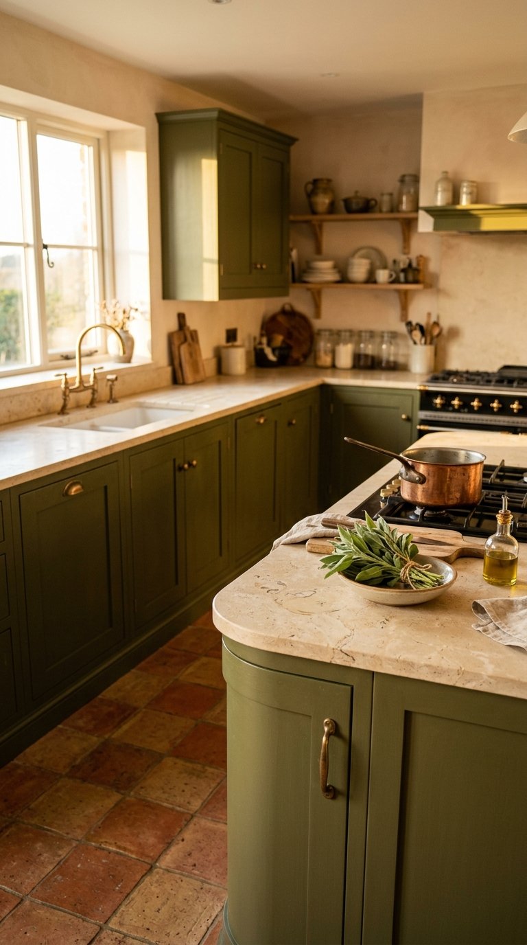
Olive green is the kitchen colour that most people consider and then talk themselves out of. The ones who commit to it rarely regret it.
Olive green sits between forest green and mustard yellow on the colour spectrum, giving it a warm, organic quality that pure greens do not have. In afternoon light, olive green kitchens glow with a genuinely beautiful warmth that photographs consistently well.
Olive green pairs naturally with terracotta tiles, natural stone countertops, aged brass hardware, and warm wood accents. The earthy palette creates a kitchen that feels like it grew rather than was installed.
Avoid pairing olive green with cool grey countertops or chrome hardware. The cool tones strip the warmth from the olive and leave the kitchen feeling muddy rather than earthy.
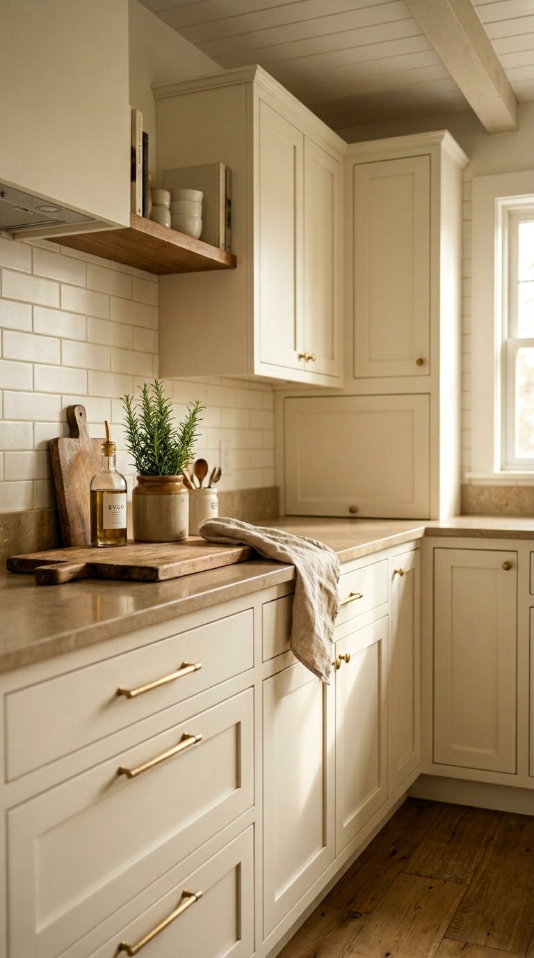
13. Use a Warm Cream Instead of White
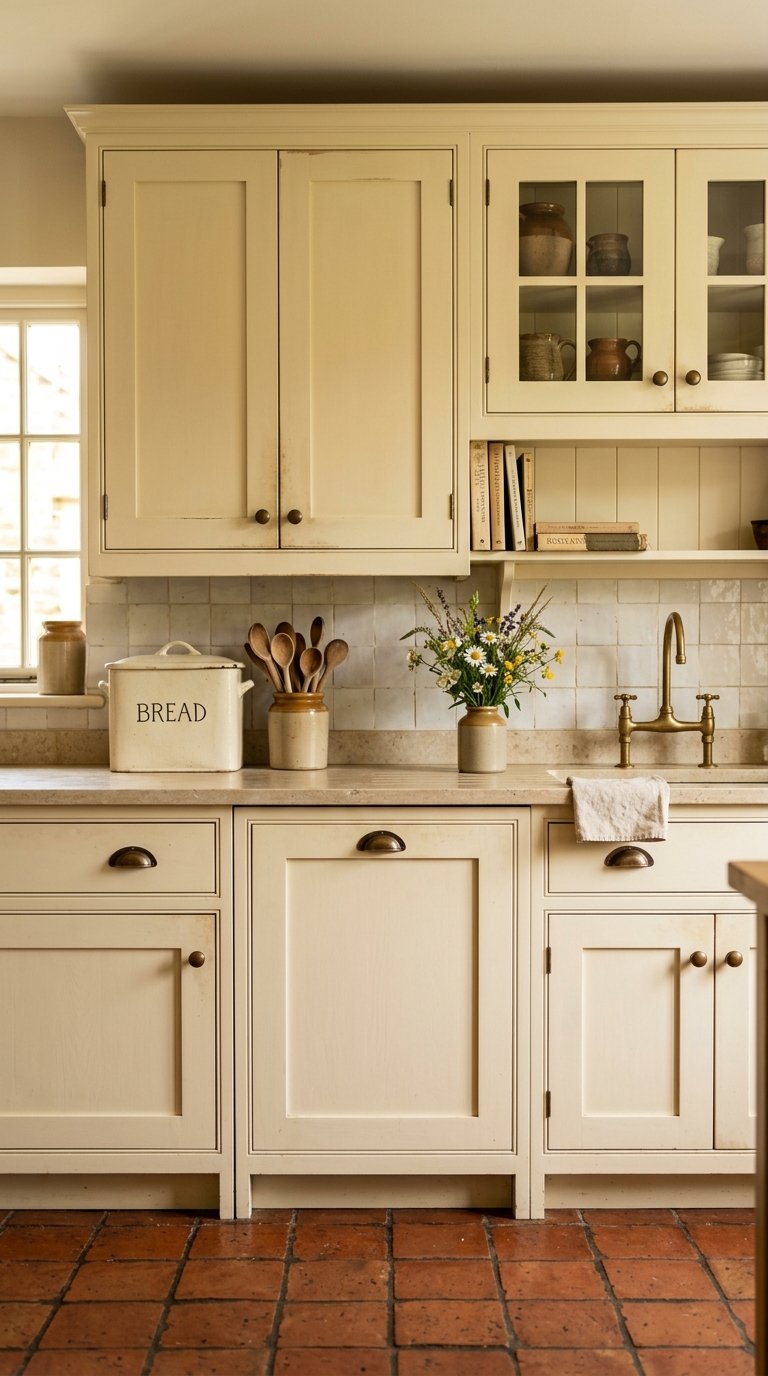
Cream cabinets occupy the territory between white and warm greige. They add warmth without any of the boldness of a colour choice, which makes them one of the most liveable long-term kitchen colour decisions.
Warm cream cabinets age beautifully, becoming richer in tone over time rather than looking tired the way bright white cabinets do. They suit traditional, farmhouse, and transitional kitchens particularly well.
Pair cream cabinets with warm stone countertops, terracotta or natural tile floors, and warm brass or bronze hardware. The warm material palette builds naturally on the cream base without requiring any bold decisions elsewhere.
The risk with cream is choosing a tone that veers too yellow or too green. Test multiple cream shades in the actual kitchen light before committing. What looks like a clean warm cream in a showroom reads very differently under the specific lighting conditions of your kitchen.
14. Paint the Backsplash Wall a Bold Colour
The backsplash wall runs behind the cooktop and sink. It is one of the most visible surfaces in the kitchen and one of the easiest to change if you later want something different.
Painting the backsplash wall in a bold colour rather than tiling it creates a graphic, high-contrast effect that costs almost nothing and changes the entire character of the kitchen. Deep teal, burnt orange, rich yellow, and deep plum all work as painted backsplash colours against white or neutral cabinets.
Use an eggshell or satin finish paint rather than matte for the backsplash wall. The slight sheen handles kitchen moisture, cleaning, and the occasional splash better than a flat matte finish.
This is the lowest-commitment bold colour decision in the kitchen. If the colour stops working, a weekend and a tin of paint fixes it completely.
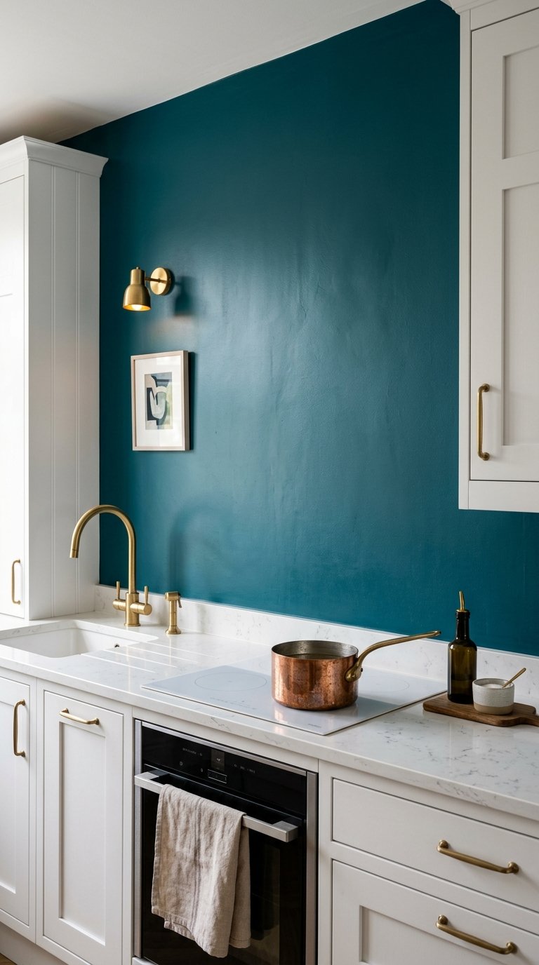
15. Choose Teal for a Kitchen That Stands Out
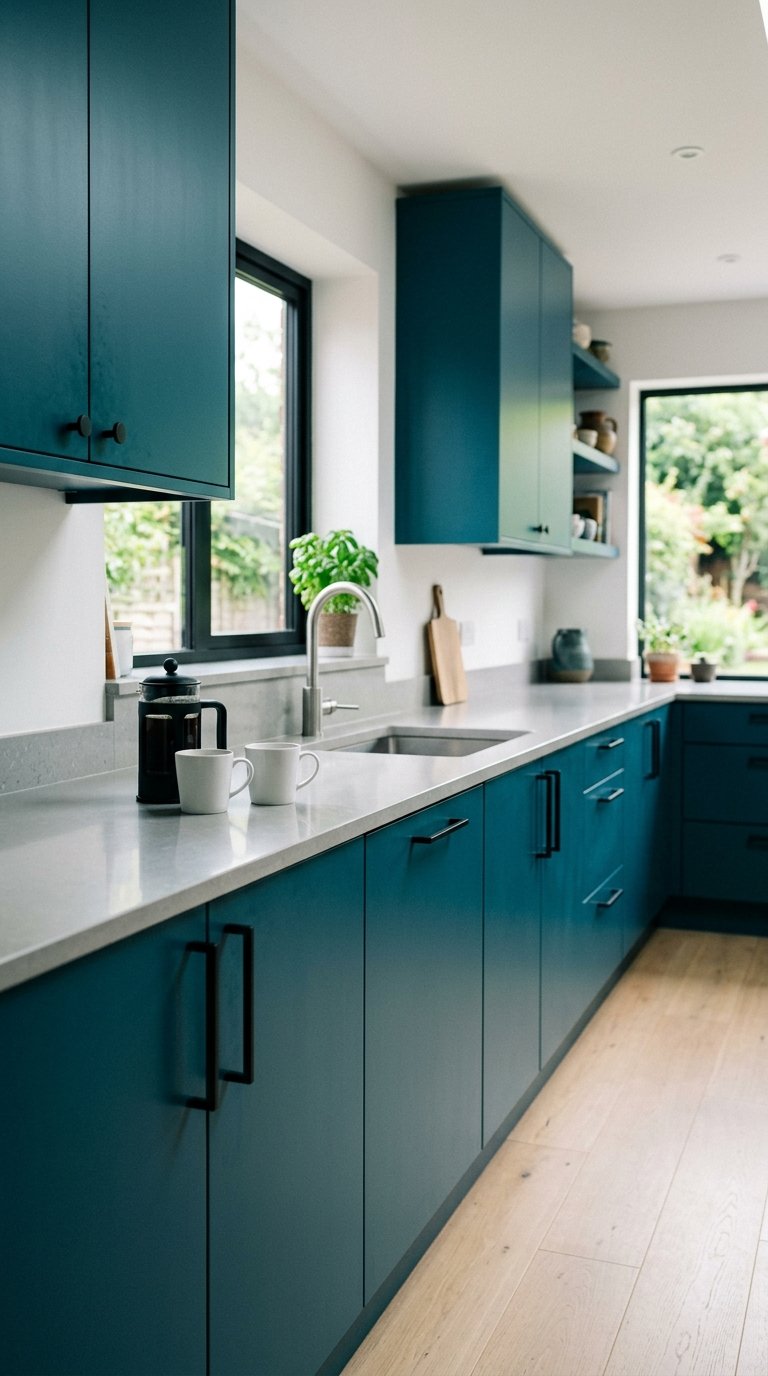
Teal sits between blue and green and works harder in a kitchen than either of those colours alone.
Deep teal on all cabinets creates a kitchen that feels both bold and sophisticated, with enough blue to feel calming and enough green to feel organic. It photographs beautifully in both natural and artificial light.
Teal works with brass, black, and polished nickel hardware. Each creates a different mood: brass for warmth and luxury, black for graphic contrast, polished nickel for a cleaner, more contemporary feel.
Pair teal cabinets with white walls and a white or light grey countertop. The contrast between the deep teal cabinetry and the light surfaces keeps the kitchen feeling bright rather than heavy. IMO, teal is one of the most underused kitchen cabinet colours and deserves far more attention than it gets.
16. Use Greige on All Cabinets
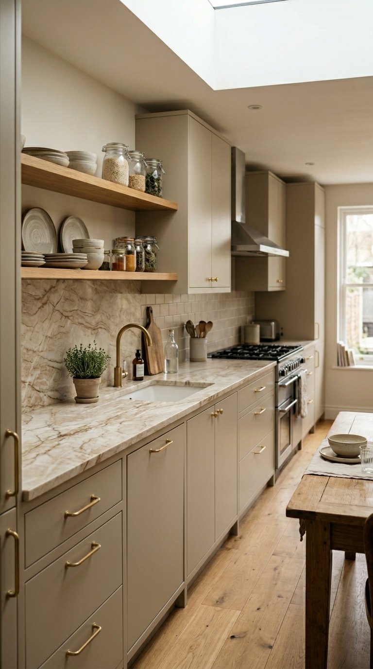
Greige, the blend of grey and beige, is the neutral that replaced plain white in kitchens that want to feel warm without committing to colour.
Greige cabinets work in almost every kitchen size, style, and lighting condition, which is both their greatest strength and their greatest risk. They are safe. They are liveable. They are also, if executed without care, completely forgettable.
The key to a greige kitchen that feels considered rather than defaulted is the quality of the secondary materials. A greige kitchen with a beautiful natural stone countertop, quality hardware, and warm wooden accents reads as designed. A greige kitchen with a laminate countertop and basic chrome hardware reads as unfinished.
Choose a greige with a clear warm undertone rather than a cool undertone. Warm greige reads as intentional. Cool greige reads as grey that could not commit.
17. Paint the Kitchen in a Single Colour Throughout
An all-one-colour kitchen, cabinets, walls, and ceiling in the same tone, creates an immersive, architectural effect that stands completely apart from standard kitchen design.
Tone-on-tone kitchens in deep green, warm terracotta, dusty blue, or soft sage create a room that reads as a complete, considered environment rather than a collection of individual surfaces. The eye reads the space as whole rather than as separate components.
This approach requires commitment and confidence. A tone-on-tone kitchen with one wall in a different colour or one cabinet section in a contrasting tone immediately looks like a mistake rather than a decision.
The finish variation between surfaces adds the subtle distinction that stops the room feeling flat. Matte on the walls, satin on the cabinets, and semi-gloss on the woodwork all in the same colour tone creates depth without breaking the colour unity.
18. Add a Coloured Tile Backsplash for Kitchen Colour Without Paint
A coloured tile backsplash brings kitchen colour through material rather than paint, which gives the colour additional texture and dimension.
Deep green zellige tiles, cobalt blue metro tiles, terracotta handmade tiles, and warm yellow encaustic tiles all add colour to a kitchen backsplash in a way that also adds texture, handmade quality, and material interest.
Zellige tiles in particular have become a go-to backsplash choice for high-end kitchen renovations. Their irregular surface and slight colour variation across each tile creates a handcrafted quality that machine-made tiles cannot replicate.
Pair a bold tile colour with a neutral cabinet colour rather than stacking two bold decisions on top of each other. A deep green zellige backsplash works beautifully against cream or white cabinets. Against forest green cabinets, it competes rather than complements.
19. Use Warm Yellow as an Accent Colour
Warm yellow in a kitchen sounds like a bold risk. Used as an accent rather than a dominant colour, it creates warmth and energy that few other colours achieve.
A warm mustard or turmeric yellow on a single run of cabinets, on the island, or on the kitchen door creates a colour accent that lifts the entire kitchen without overwhelming it. The yellow catches light and brightens the room in a way that cooler accent colours do not.
Warm yellow pairs well with dark navy, deep charcoal, and natural wood. A navy and yellow kitchen feels graphic and considered. A charcoal and yellow kitchen feels dramatic and warm. A natural wood and yellow kitchen feels organic and sunny.
Avoid bright primary yellow. The warmth and sophistication of this colour idea depends entirely on choosing a muted, earthy yellow rather than a nursery or school-corridor yellow.
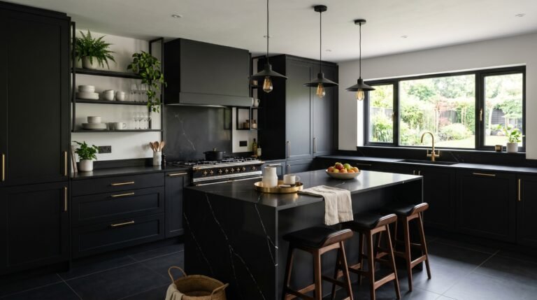
20. Go With Matte Black on All Cabinets
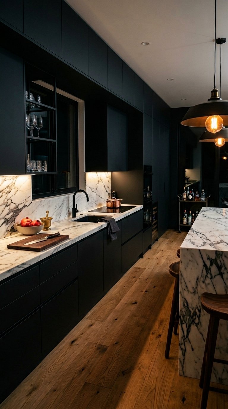
An all-black kitchen is the boldest colour decision on this list. It is also one of the most consistently impressive when executed correctly.
Matte black on all cabinets creates a kitchen that feels dramatic, considered, and entirely uncompromising in its aesthetic. It photographs like a professional kitchen and functions like one too.
The critical requirement for a black kitchen is excellent lighting. Overhead recessed lights, under-cabinet LED strips, and pendant lights above the island all work together to ensure the kitchen surfaces stay visible and the room does not feel like a cave.
Pair matte black cabinets with a light countertop in white marble or light quartz and a warm-toned wood floor. The contrast between the black cabinetry and the light surfaces and floor creates the visual balance that stops the room feeling oppressive.
21. Choose Burnt Orange for a Warm, Energetic Kitchen
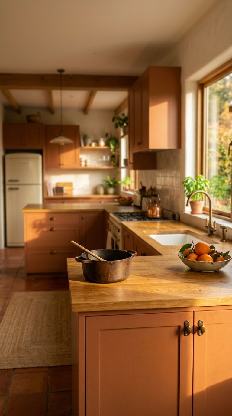
Burnt orange in a kitchen creates warmth and energy in a way that no other colour achieves. It is not for the timid. But the people who commit to it never look back. 🙂
Burnt orange cabinets in a muted, earthy tone, not a traffic cone orange, create a kitchen that feels warm, vibrant, and genuinely distinctive without being aggressive or overwhelming.
Pair burnt orange cabinets with natural wood countertops, terracotta tile floors, and aged bronze hardware. The warm earthy palette builds naturally on the orange base and keeps the room feeling organic rather than fluorescent.
The key distinction is tone. A muted, brownish-orange reads as sophisticated. A bright, saturated orange reads as a commercial kitchen or a fast food outlet. Choose a burnt or earthy orange, and test it at full scale before committing.
22. Use a Soft Lavender for an Unexpected but Beautiful Kitchen
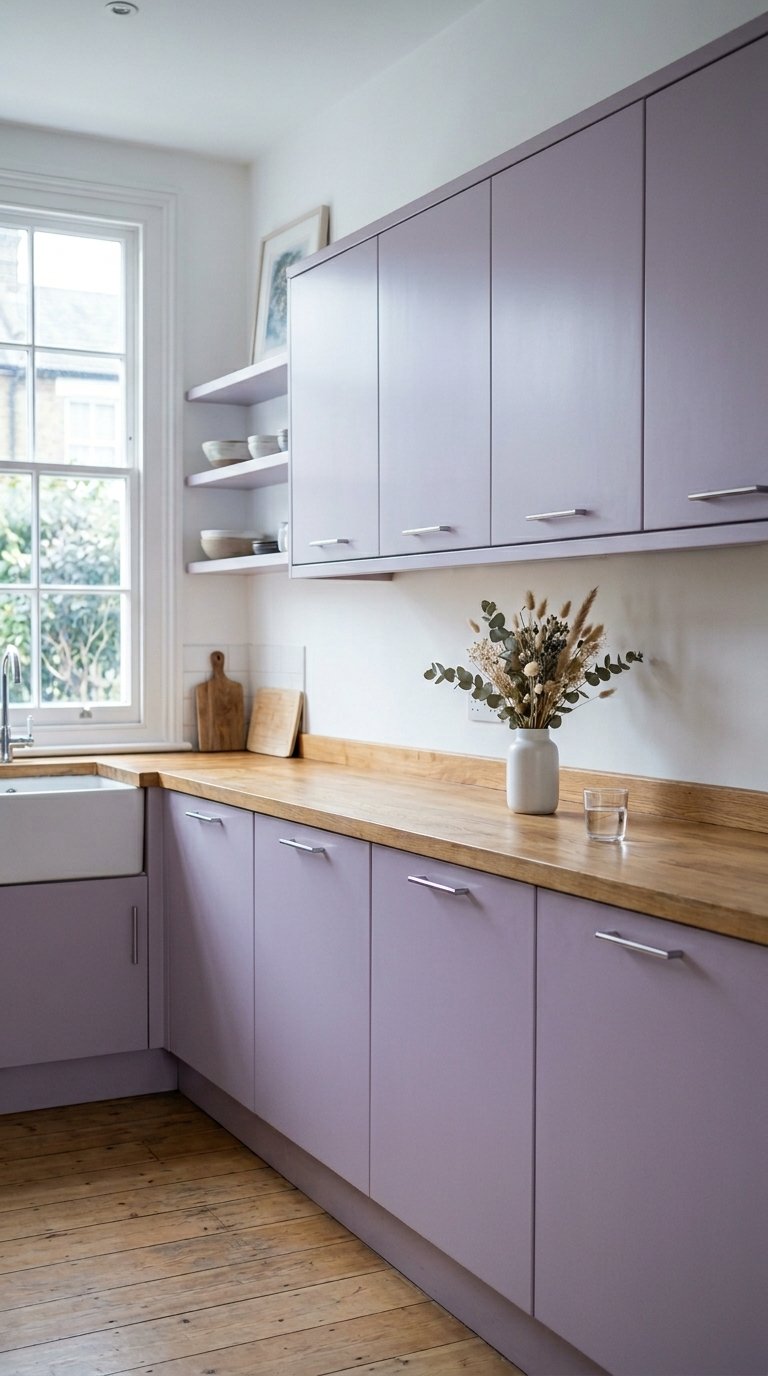
Lavender in a kitchen sounds wrong until you see it done well. Then it sounds obvious.
Soft, dusty lavender on kitchen cabinets creates a quiet, gentle atmosphere that feels unlike any other kitchen colour. It reads as almost neutral in cool morning light and as a soft purple in warm afternoon light.
Lavender works best in kitchens with white walls, natural wood countertops, and simple brass or chrome hardware. The soft, gentle quality of the colour needs to breathe against clean, simple surfaces rather than compete with pattern or texture.
This works best as a full cabinet colour rather than a two-tone approach. Pairing lavender with another colour creates confusion rather than the quiet, considered quality that makes soft lavender kitchens so appealing.
23. Keep It All White but Do It Properly
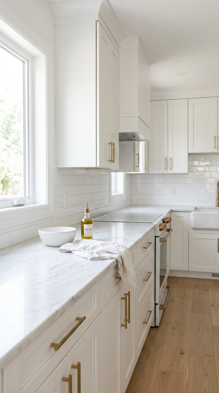
An all-white kitchen done correctly is one of the most enduringly beautiful colour approaches in residential design. An all-white kitchen done lazily looks like a showroom that never sold.
The difference between a considered all-white kitchen and a flat, uninteresting one is material variation. White cabinets, white walls, and white countertops need to bring texture through the materials rather than through colour. Marble countertops, glossy subway tile backsplash, matte painted walls, satin cabinet doors.
The variation in finish across different white surfaces creates visual depth that colour would otherwise provide. The eye reads surface quality and texture variation even within a single colour palette.
Hardware becomes the critical decision in an all-white kitchen. Brushed brass, matte black, and polished chrome all read completely differently against white cabinets. The hardware finish is the accent colour in an all-white kitchen, whether you treat it that way or not.
Final Thoughts
Kitchen colour is not a single decision. It is a series of decisions made in sequence, each one affecting the next.
Start with the cabinets. This is the largest surface area and the highest-cost change. Get the cabinet colour right first. Then work through walls, backsplash, countertop, and hardware as supporting decisions that serve the cabinet colour rather than compete with it.
Test every colour at full scale in the actual kitchen before committing. Paint chips and small samples lie. A large sample patch on the actual cabinet surface or wall in the actual kitchen light tells you the truth.
You do not need all 23 ideas. You need the one or two that suit your specific kitchen, your specific light, and how you actually use the space. Pick those, test them properly, and commit without second-guessing.
The right kitchen colour does not just change how your kitchen looks. It changes how much you enjoy spending time in it. That is worth getting right.