21 Kitchen Cabinet Color Ideas That Instantly Add Style
The cabinet color you choose defines the entire character of your kitchen. It sets the tone before the countertop, the backsplash, or the hardware gets a single vote. Get it right and the rest of the room falls into place. Get it wrong and no amount of styling fixes it. These 21 kitchen cabinet color ideas give you the specific paint names, real brand recommendations, accurate price points, and honest reasons each color works so you make the right decision the first time.
No color swatches pulled from a magazine spread. No generic “warm neutrals” advice. Just cabinet colors that perform in real kitchens under real lighting conditions.
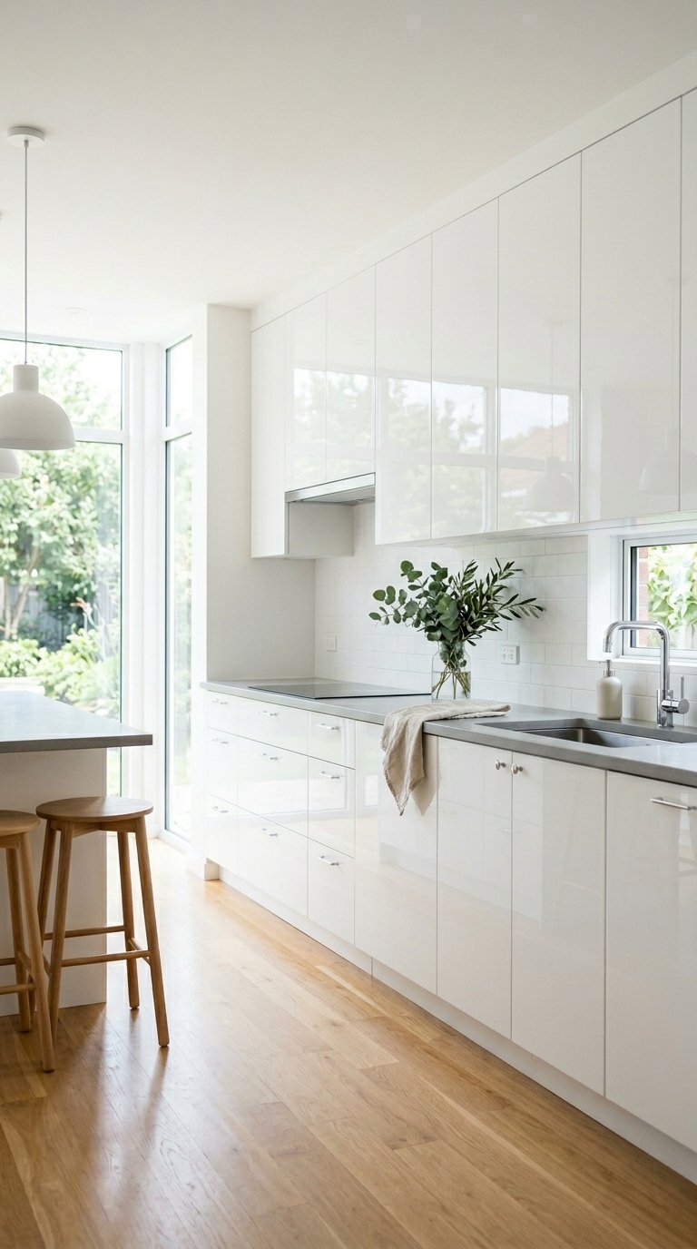
1. Simply White by Benjamin Moore
Simply White OC-17 is the most consistently successful white cabinet color across every kitchen style because it reads as warm rather than stark without pulling into cream or yellow territory. The warm undertone prevents the cabinets from looking clinical under cool natural light while still reading as crisp white in photographs and in person.
Benjamin Moore’s Advance alkyd paint in Simply White costs $70 per gallon and delivers a hard, factory-smooth finish that resists kitchen grease and wipes clean without dulling. Apply two coats with a fine-nap roller for a result that reads as spray-applied on flat-front and shaker door styles alike. Pair it with unlacquered brass hardware and a warm gray quartz countertop for the combination that suits the widest range of kitchen styles without requiring a design commitment to any single aesthetic.
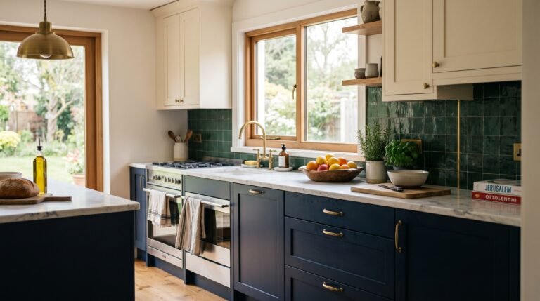
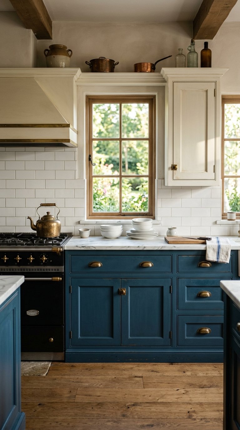
2. Hale Navy by Benjamin Moore
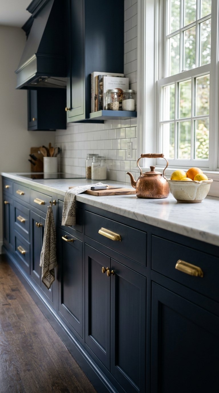
Hale Navy HC-154 is the navy blue that started the dark cabinet trend and remains the best-performing example of it because the color carries a warm undertone that prevents it from reading as cold or corporate. Navy kitchen cabinets add visual weight and sophistication to a room that white and gray cabinets never achieve, and Hale Navy does it with a blue tone that suits both traditional and contemporary kitchen styles.
Apply Hale Navy in Benjamin Moore’s Advance alkyd at $70 per gallon for a durable finish that holds its depth of color without fading under kitchen lighting. Pair it with brass or unlacquered brass hardware, white marble or quartz countertops, and white subway tile backsplash for the combination that has proven its staying power across ten years of kitchen renovations. FYI, Hale Navy on lower cabinets with Simply White on uppers is the two-tone pairing that interior designers recommend more than any other combination in this list.
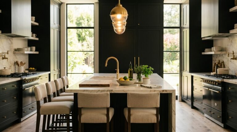
3. Tricorn Black by Sherwin-Williams
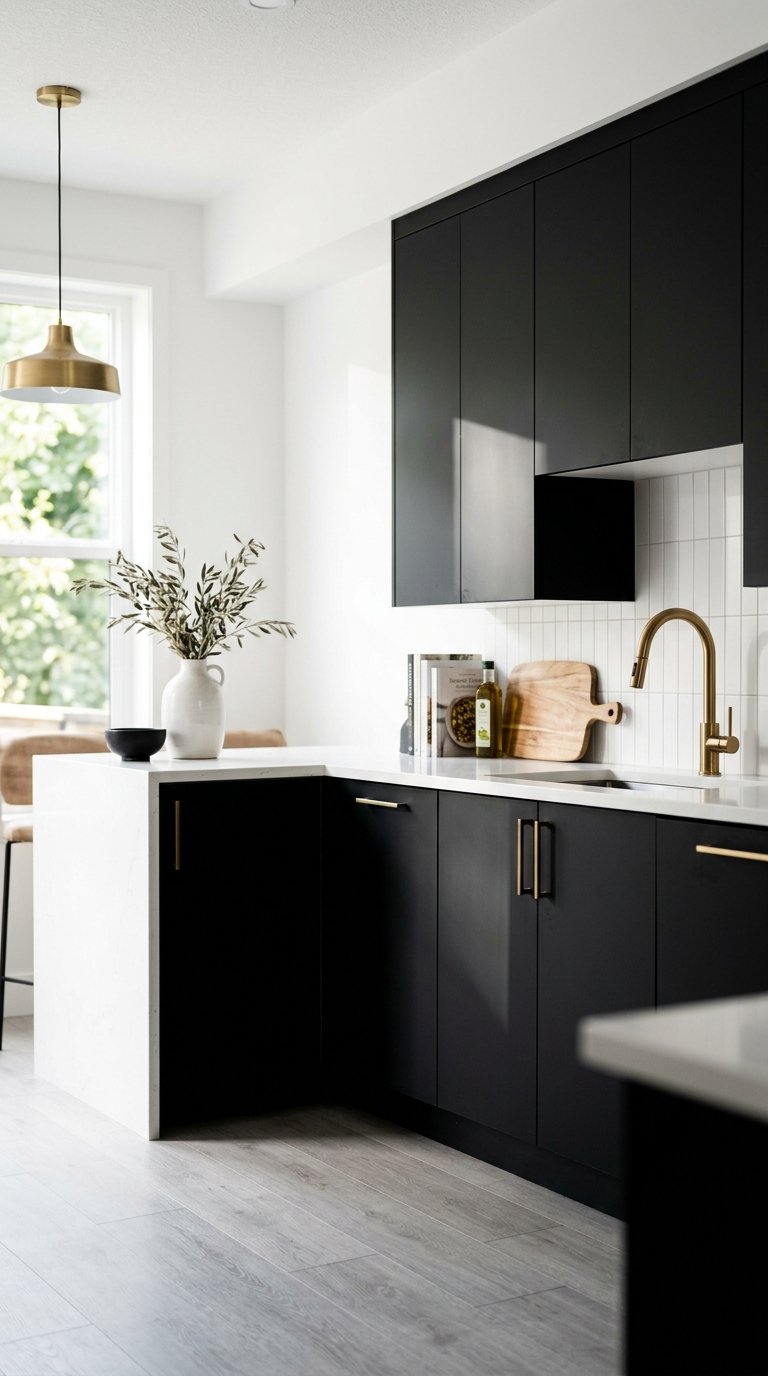
Tricorn Black SW 6258 is the truest, most balanced black in Sherwin-Williams’ paint line because it carries neither a blue nor a brown undertone that reveals itself in changing light conditions. A black cabinet color with a hidden undertone reads differently at noon than at dusk, which is the problem most homeowners encounter when they paint cabinets in an off-brand black and dislike the result six months later.
Apply Tricorn Black in Sherwin-Williams’ Emerald Urethane enamel at $72 per gallon for a hard, scrubbable finish that holds the deep black tone without chalking or dulling over time. Pair it with white quartz countertops, white walls, and brass or copper hardware for a high-contrast kitchen that reads as designed from every angle. Tricorn Black on a kitchen island with white perimeter cabinets is the single most impactful cabinet color decision you make at the lowest relative cost.
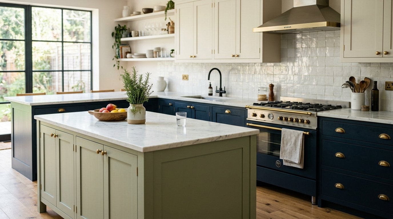
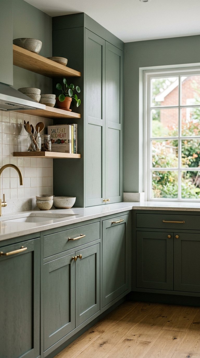
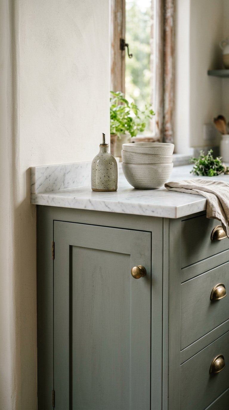
4. Pewter Green by Sherwin-Williams
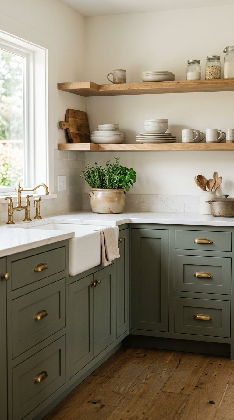
Pewter Green SW 6208 is the sage green that defines the modern farmhouse kitchen color palette and the most searched cabinet color on Pinterest for three consecutive years through 2024. The muted, gray-green tone sits between olive and sage without committing to either, which gives it a flexibility that pure sage or pure olive greens lack.
Apply Pewter Green in Sherwin-Williams’ Emerald Urethane enamel at $72 per gallon for a finish that resists kitchen moisture and wipes clean without streaking. Pair it with white quartz or honed marble countertops, unlacquered brass hardware, and white oak open shelving for a kitchen that reads as collected and considered without effort. Use it on lower cabinets only with white uppers if you want the sage color without full kitchen commitment.
5. Repose Gray by Sherwin-Williams
Repose Gray SW 7015 is the gray cabinet color that reads as a true neutral across the widest range of lighting conditions because its undertone shifts between warm and cool depending on the light source, which prevents it from clashing with adjacent materials. Most gray paints read purple, blue, or green under certain light. Repose Gray does not.
Apply it in Sherwin-Williams’ Emerald Urethane at $72 per gallon. Pair it with white countertops and backsplash for a tone-on-tone gray-and-white kitchen, or with warm wood countertops and brass hardware to push the gray toward a warmer, more organic reading. Repose Gray suits kitchens that need a cabinet color with staying power across ownership periods and resale contexts where a bold color carries higher risk.
6. Chantilly Lace by Benjamin Moore
Chantilly Lace OC-65 is a cooler, brighter white than Simply White and the choice for kitchens that need maximum light reflection from the cabinet surfaces. Where Simply White reads warm and soft, Chantilly Lace reads crisp and clean, which suits contemporary, Scandinavian, and minimalist kitchens where a warm white would feel too soft.
Apply Chantilly Lace in Benjamin Moore’s Advance alkyd at $70 per gallon. Pair it with cool gray or white quartz countertops, chrome or brushed nickel hardware, and a white or light gray tile backsplash for a kitchen that reads as bright and sharp under both natural and artificial light. Use it in north-facing kitchens with limited natural light where a warm white reads yellow and a true white reads cold. Chantilly Lace sits exactly between those two problems.
7. Farrow and Ball Railings No.31
Railings No.31 is Farrow and Ball’s dark navy-black, a color with enough blue undertone to read as deeply atmospheric without committing fully to black. It suits traditional, Georgian, and transitional kitchens where Tricorn Black reads as too stark and Hale Navy reads as too obviously blue.
Farrow and Ball’s estate eggshell finish costs $120 per 2.5-liter tin, which covers roughly one cabinet door run in a standard kitchen. The price reflects the pigment density and the distinctive chalky depth of color that Farrow and Ball achieves in a way no mass-market paint brand fully replicates. Pair Railings with aged brass hardware, a warm white marble countertop, and a cream or off-white backsplash for a kitchen with the richest visual depth on this list.
8. Benjamin Moore Newburyport Blue HC-157
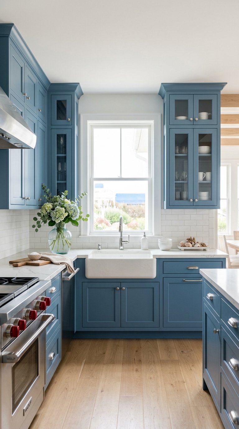
Newburyport Blue HC-157 is a medium-toned coastal blue that sits between sky blue and navy and suits kitchens where Hale Navy reads as too dark and a pastel blue reads as too light. The color references the painted wooden architecture of New England coastal homes, which is why it performs so naturally in farmhouse, coastal, and traditional kitchen contexts.
Apply it in Benjamin Moore’s Advance alkyd at $70 per gallon. Pair it with white shaker cabinet uppers, white marble countertops, and chrome or brushed nickel hardware for a coastal kitchen combination that reads as genuine rather than themed. Use it on an island base with white perimeter cabinets for a lower-commitment introduction to a blue kitchen before committing to the full cabinet run.
9. Sherwin-Williams Evergreen Fog SW 9130
Evergreen Fog SW 9130 is Sherwin-Williams’ 2022 Color of the Year and remains one of the most versatile green-gray cabinet colors available because it sits at the exact intersection of green, gray, and sage without pulling strongly toward any single one of those tones. The ambiguity of the color is the strength. It reads differently in morning light versus evening light, which gives the kitchen visual variation throughout the day.
Apply it in Sherwin-Williams’ Emerald Urethane at $72 per gallon. Pair it with warm white countertops, natural wood open shelves, and matte black or unlacquered brass hardware. It suits both contemporary and farmhouse kitchens and reads as more sophisticated than Pewter Green for kitchens that want a green cabinet without the strong farmhouse association that sage green carries.
10. Benjamin Moore Knoll Green HC-131
Knoll Green HC-131 is a deep, saturated hunter green that suits kitchens ready for a bold, permanent color statement. Where sage and muted greens read as soft and organic, Knoll Green reads as bold and architectural. It suits traditional, Victorian-inspired, and contemporary kitchens where the cabinets are meant to be the dominant design element in the room.
Apply it in Benjamin Moore’s Advance alkyd at $70 per gallon for a hard finish that holds the deep pigment saturation without fading under kitchen lighting. Pair it with polished brass or unlacquered brass hardware, white or cream marble countertops, and a white subway tile backsplash. The contrast between the deep green and the white surfaces delivers the highest visual energy of any green cabinet color on this list.
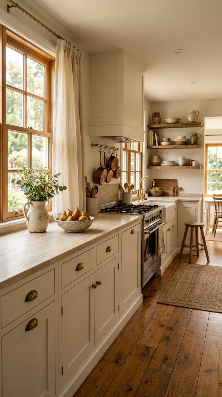
11. Pale Oak by Benjamin Moore
Pale Oak OC-20 is Benjamin Moore’s most successful warm greige, a color that reads as neither gray nor beige but shifts between the two depending on the light. It suits kitchens where a full white feels too bright and a gray feels too cool. The warm undertone of Pale Oak keeps the kitchen feeling hospitable under the cooler artificial lighting that most kitchens use after dark.
Apply it in Advance alkyd at $70 per gallon. Pair it with warm wood countertops, brass hardware, and cream or off-white walls for a tonal, layered kitchen palette where every element reads in the same warm family of colors. This is the cabinet color for homeowners who want a warm neutral that works without requiring deliberate coordination with other surfaces. Pale Oak does that coordination for you.
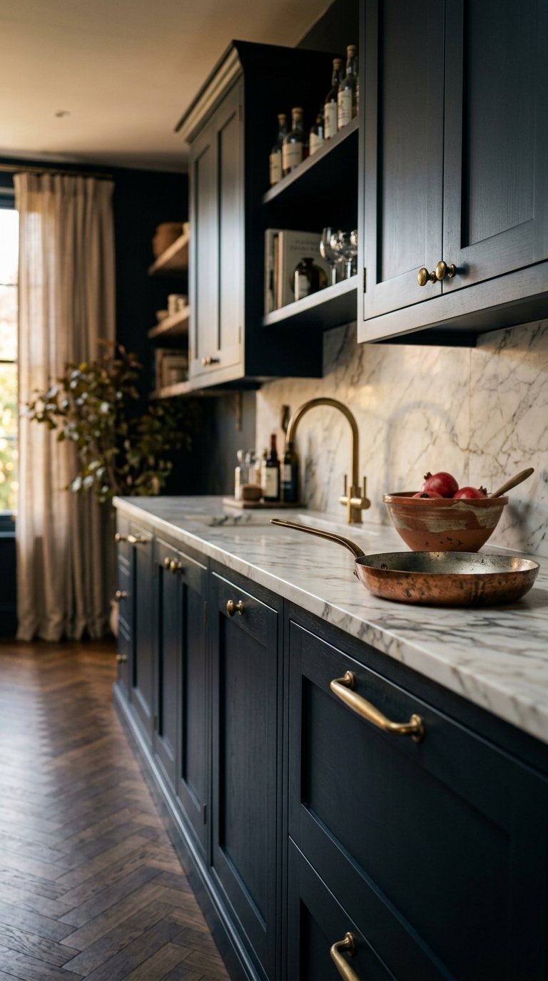
12. Off-Black No.57 by Farrow and Ball
Off-Black No.57 is Farrow and Ball’s warm black with a subtle brown undertone that prevents it from reading as a cold, flat black in natural light. The warmth in the undertone suits kitchens with wood floors, brass hardware, and natural stone countertops where a cool true black would create a harsh contrast with the warm surrounding materials.
At $120 per 2.5-liter tin in Farrow and Ball’s estate eggshell, the cost per kitchen is higher than any mass-market equivalent. The result, a black cabinet with depth, warmth, and the distinctive Farrow and Ball chalky finish, justifies the premium for homeowners who want a black kitchen that feels warm rather than industrial. Pair it with warm white walls, unlacquered brass hardware, and a honed limestone or marble countertop.
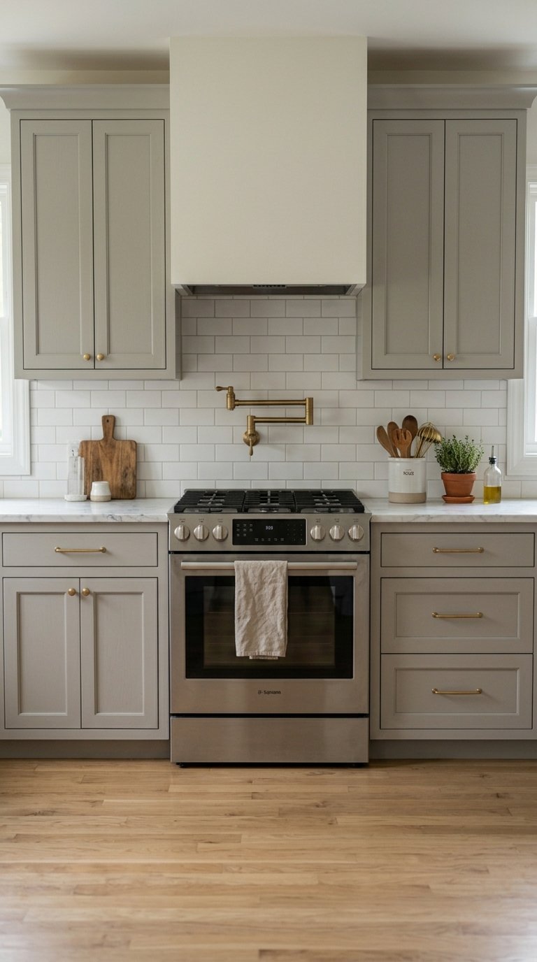
13. Sherwin-Williams Accessible Beige SW 7036
Accessible Beige SW 7036 is the safest warm neutral cabinet color on this list and the one with the highest resale value protection because it reads as universally appealing across buyer demographics. It suits kitchens in homes approaching the market where a bold color introduces preference risk.
Apply it in Sherwin-Williams’ Emerald Urethane at $72 per gallon. Pair it with warm white walls, simple brushed nickel hardware, and a light quartz or granite countertop. The result is a kitchen that reads as clean, warm, and complete without triggering any strong personal reaction in either direction. That neutrality is a functional advantage in a resale context even if it is less exciting in a personal design context. IMO, Accessible Beige is the color you choose when you need the kitchen to appeal to everyone, not just yourself.
14. Benjamin Moore Van Deusen Blue HC-156
Van Deusen Blue HC-156 is a deeper, more saturated colonial blue that suits traditional and historical kitchen styles where Hale Navy reads as too contemporary and Newburyport Blue reads as too light. The color references the painted millwork of 18th and 19th century American architecture, which makes it an authentic choice for restored farmhouses, colonial homes, and traditional kitchen renovations.
Apply it in Benjamin Moore’s Advance alkyd at $70 per gallon. Pair it with cream or antique white upper cabinets, aged brass hardware, and a white marble or soapstone countertop. The combination reads as historically grounded and deeply considered in a way no light blue cabinet color achieves at any paint price point.
15. Warm White OC-45 by Benjamin Moore
Warm White OC-45 sits between Simply White and a true cream and suits kitchens with warm lighting, wood floors, and natural stone surfaces where Simply White reads too cool and a cream reads too yellow. The color is particularly effective in kitchens with aged brass hardware and warm wood elements where the slight warmth of the cabinet color ties all the warm materials together.
Apply it in Advance alkyd at $70 per gallon. Use it on full kitchen cabinet runs in traditional and farmhouse kitchens where the goal is a warm, soft cabinet that recedes visually and lets the countertop, backsplash, and hardware carry the design weight. Warm White reads best in kitchens with abundant natural light where the warmth of the tone is balanced by the brightness of the room.
16. Sherwin-Williams Dark Night SW 6237
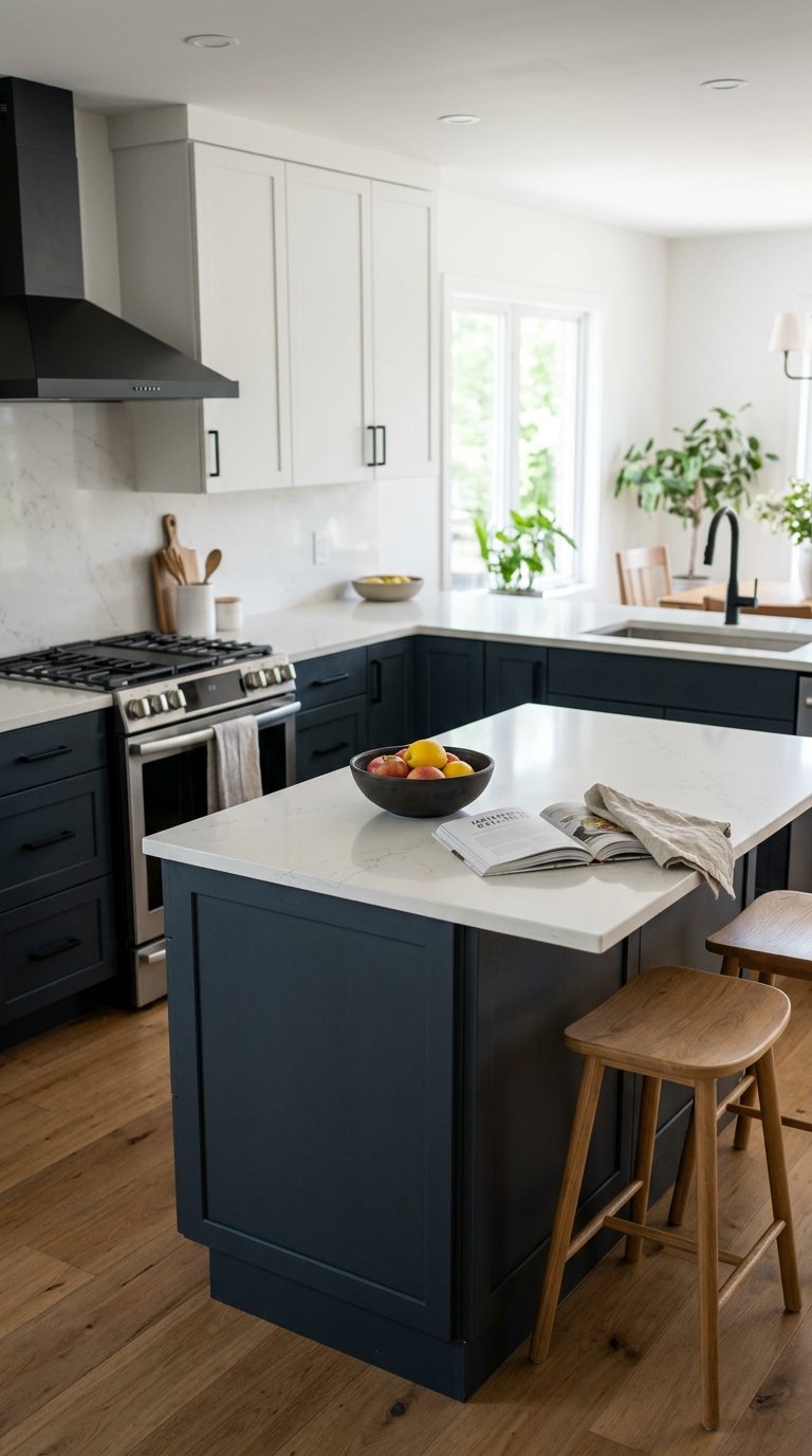
Dark Night SW 6237 is a deep charcoal with a subtle blue-gray undertone that suits contemporary and transitional kitchens where Tricorn Black reads as too stark and a mid-gray reads as too light. The color occupies a tone between dark gray and near-black that delivers visual weight without the full commitment of a true black cabinet.
Apply it in Sherwin-Williams’ Emerald Urethane at $72 per gallon. Pair it with light quartz countertops, matte black or brushed nickel hardware, and a light gray or white tile backsplash. Dark Night on lower cabinets with white uppers creates a two-tone kitchen with a darker, more dramatic lower zone than Hale Navy or Pewter Green delivers in the same configuration.
17. Benjamin Moore Wythe Blue HC-143
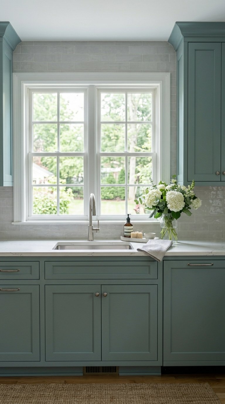
Wythe Blue HC-143 is a soft, muted blue-green that reads as spa-like and calming in a kitchen environment without committing to the strong farmhouse connotations of sage green or the strong coastal connotations of a brighter blue. It suits kitchens where the homeowner wants a color that feels relaxing rather than energizing.
Apply it in Advance alkyd at $70 per gallon. Pair it with white quartz countertops, chrome or brushed nickel hardware, and a white or soft gray tile backsplash. The muted tone of Wythe Blue reads as sophisticated rather than pastel, which keeps the kitchen from feeling like a bathroom color despite the spa-adjacent quality of the hue. Use it on a kitchen island for a single dose of the color before committing to the full cabinet run.
18. Farrow and Ball Mizzle No.266
Mizzle No.266 is Farrow and Ball’s complex green-gray that reads as neither green nor gray definitively, shifting between the two depending on light and surrounding colors. It suits kitchens where Evergreen Fog reads as too obviously green and Repose Gray reads as too obviously gray. The ambiguity of Mizzle creates a cabinet color that seems to change throughout the day, which keeps the kitchen visually interesting across morning, afternoon, and evening light.
At $120 per 2.5-liter tin, apply it in Farrow and Ball’s estate eggshell for the characteristic depth and chalky quality that makes this color work at its best. Pair it with warm white plaster walls, unlacquered brass hardware, and a honed white marble countertop. The Farrow and Ball finish interacts with natural light differently than any latex paint equivalent, which makes Mizzle one of the most visually sophisticated cabinet colors on this list.
19. Benjamin Moore Icicle OC-68
Icicle OC-68 is the closest thing to a true pale blue-white in Benjamin Moore’s white collection, a color that reads as almost white with a whisper of blue that becomes visible only when placed directly beside a true white. It suits Scandinavian, coastal, and minimalist kitchens where a pure white reads as too harsh and a light gray reads as too warm.
Apply it in Advance alkyd at $70 per gallon. Pair it with polished chrome hardware, white quartz countertops, and a white or light gray tile backsplash for a kitchen that reads as clean and airy without any identifiable color presence. Icicle reads best in kitchens with strong natural light where the faint blue undertone becomes a cool, refreshing quality rather than a cold problem.
20. Sherwin-Williams Urbane Bronze SW 7048
Urbane Bronze SW 7048 was Sherwin-Williams’ 2021 Color of the Year and remains one of the strongest warm dark neutrals for kitchen cabinets because it reads as a sophisticated brown-gray-green in a single tone that connects to natural materials better than any pure gray or pure brown achieves. The color suits kitchens with warm wood floors, natural stone countertops, and organic material palettes where a cool dark color would feel disconnected from the surrounding warmth.
Apply it in Sherwin-Williams’ Emerald Urethane at $72 per gallon. Pair it with warm white walls, unlacquered brass hardware, and a honed walnut or soapstone countertop for a kitchen with an earthy, grounded palette that reads as deeply considered. Urbane Bronze performs best in kitchens with warm light sources because cool or blue-toned artificial lighting flattens the complexity of the color into a plain dark gray.
21. Benjamin Moore White Dove OC-17
White Dove OC-17 is the warm white that designers choose when they want a cabinet color that reads as white in photographs but feels warmer and softer in person. The distinction between White Dove and a cooler white is subtle but significant in a kitchen you occupy daily. The warmth of White Dove makes the room feel hospitable rather than sterile at every time of day.
Apply it in Benjamin Moore’s Advance alkyd at $70 per gallon. Pair it with warm wood countertops, unlacquered brass hardware, and cream or warm white walls for a tonal kitchen where every element sits in the same warm color family. White Dove suits traditional, farmhouse, and transitional kitchens equally well and carries none of the design trend associations that bolder colors accumulate over time. It is the cabinet color you choose when you want the room to feel permanently right rather than temporarily current.
Final Thoughts
Your cabinet color does more work than any other single decision in the kitchen. It sets the light level, the mood, the material associations, and the design style of the entire room before anything else gets installed.
The 21 colors on this list cover every kitchen style and every level of design commitment, from the universally safe Accessible Beige at one end to the deeply saturated Knoll Green and Farrow and Ball Railings at the other. Every color includes a specific paint brand, a real price, a recommended finish, and at least one proven hardware and countertop pairing so you walk away with a complete decision rather than just a color name.
Pick the color that solves your kitchen’s specific visual problem first. Too dark? Go Chantilly Lace or Icicle. Too bland? Go Hale Navy or Tricorn Black on the island. Too cold? Go Simply White or White Dove. Fix the problem with one color chosen for a specific reason, and the rest of the kitchen follows.