23 Kitchen Color Palette Ideas to Refresh Your Space
Your kitchen color palette is the decision that affects every other choice in the room, from cabinet hardware to countertop selection to the color of your small appliances, and most people make it by picking a paint color they like without thinking about what it actually does to the whole space. I repainted my kitchen three times in four years before landing on a palette that works at every hour of the day, in every light condition, and with every finish in the room. These 23 kitchen color palette ideas give you a clear starting point and tell you exactly why each combination works rather than just what it looks like in a staged photo.
1. Warm White Cabinets With Warm Grey Walls
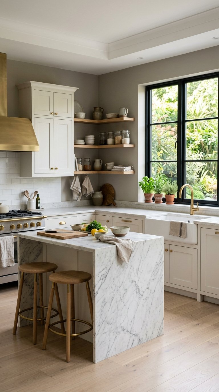
Warm white cabinets against warm grey walls is the kitchen palette that works in more homes than any other single combination, because both tones share the same warm undertone that keeps them from clashing and both stay relevant across décor style changes without requiring a full repaint. Benjamin Moore’s Chantilly Lace on cabinets and Revere Pewter on walls is the most replicated version of this palette for good reason.
The warm undertone in both colors prevents the cool, clinical feel that pure white cabinets against cool grey walls create. Add natural wood tones in open shelving or a butcher block section, and brass or unlacquered hardware for the third element that ties the palette into a full kitchen color story.
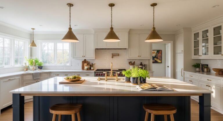
2. Navy Blue Lower Cabinets With White Uppers
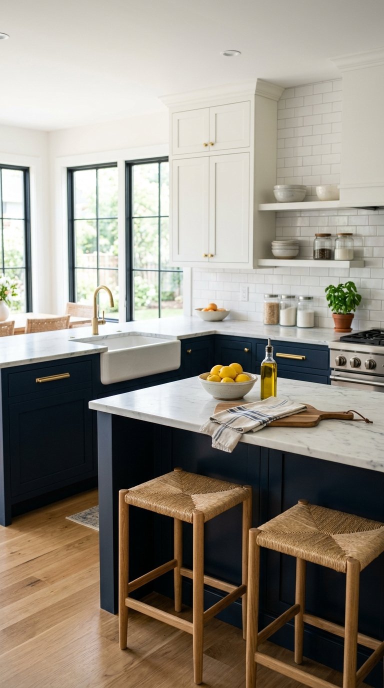
Two-tone cabinets with navy lowers and white uppers solve the “I want color but I’m afraid of too much color” problem by concentrating the bold tone at cabinet base height where it grounds the room and keeping the upper zone bright and light to maintain visual openness. The navy-to-white split also makes ceilings feel higher because the eye moves from dark at the base to light above.
Benjamin Moore’s Hale Navy on lower cabinets paired with White Dove on uppers is one of the most searched kitchen color combinations for good reason. It works in farmhouse, transitional, and contemporary kitchens without stylistic adjustment, since navy reads as classic rather than trendy across all three contexts.
3. Sage Green Cabinets With Cream Walls
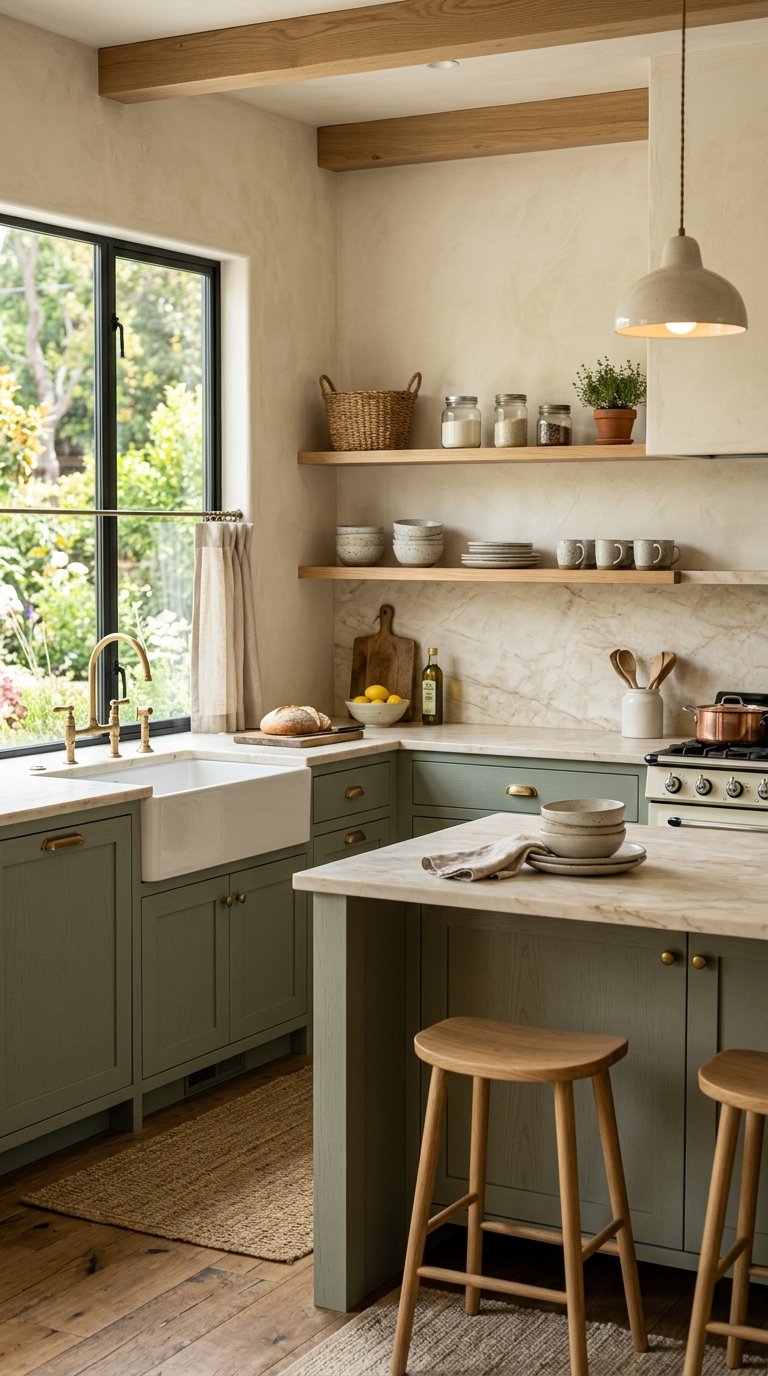
Sage green cabinets with cream walls deliver warmth and nature-adjacent color without the high maintenance commitment of deeper greens that show fingerprints, grease, and dust more visibly. The muted, grey-green tone of sage sits in the warm neutral family, which means it pairs effortlessly with wood tones, brass hardware, and natural stone countertops.
Sherwin Williams Retreat, Benjamin Moore’s Aganthus Green, and Clare’s Wanderlust all hit the right sage tone without pulling toward yellow-green or blue-green, which read as dated rather than timeless. Paint the walls in a warm cream like BM White Dove or Sherwin Williams Alabaster rather than a stark white, since pure white walls fight the warmth of sage cabinets rather than supporting it.
4. All-White Kitchen With Black Hardware and Countertops
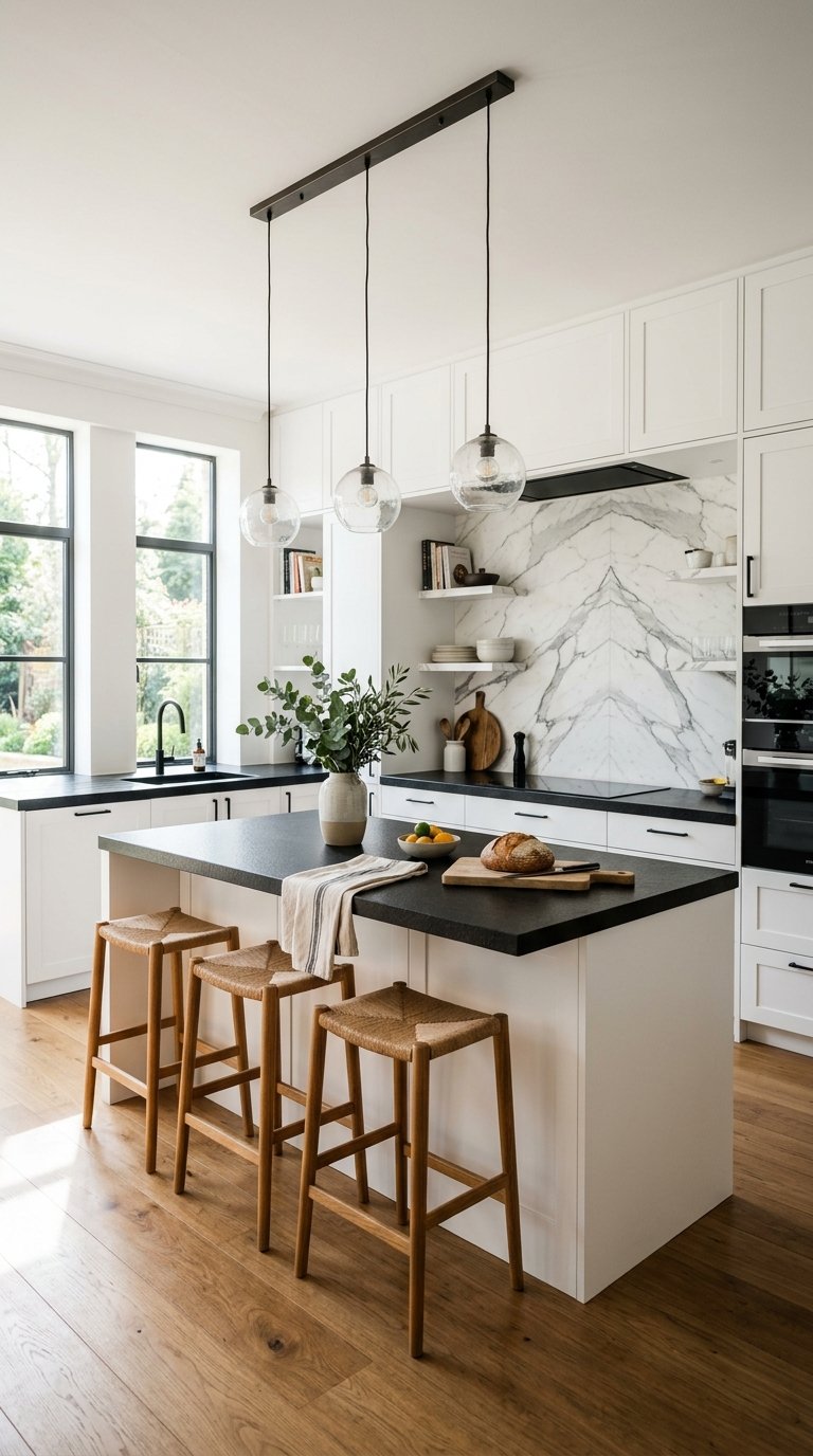
An all-white kitchen with black hardware and black countertops uses high contrast as its entire palette strategy, which works because the graphic black-and-white combination reads as intentional rather than undecided. The black hardware and countertop anchor the white cabinet faces and prevent the all-white kitchen from looking unfinished.
Matte black hardware from brands like Amerock or Liberty Hardware costs $5 to $15 per piece, and replacing standard brushed nickel hardware across a full kitchen runs $100 to $300 total for the material. Leathered or honed black granite, black quartz, or soapstone countertops complete the contrast palette for $50 to $120 per square foot installed depending on material and region.
5. Forest Green Cabinets With Warm Wood Open Shelving
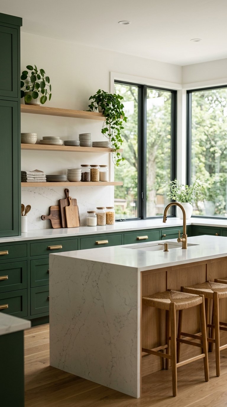
Forest green cabinets paired with warm wood open shelving is the kitchen color palette that photographs best on natural light, and it’s been the most consistently popular kitchen renovation color choice across the past three years for that reason. The dark green absorbs light and creates depth while the wood shelving adds warmth that prevents the kitchen from reading as cold.
Farrow & Ball’s Calke Green, Sherwin Williams’ Hunt Club, and Benjamin Moore’s Forest Green all deliver the right depth without pulling too blue or too yellow. Keep walls neutral (a warm white or light greige) so the green cabinets read as the palette’s feature rather than competing with a wall color for the room’s attention.
6. Terracotta Walls With White Cabinets
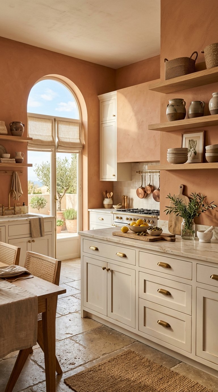
Terracotta walls with white cabinets create a Mediterranean-inspired kitchen palette that feels warm, inviting, and genuinely different from the blue-grey and greige combinations that dominated kitchen design for a decade. The terracotta brings orange-brown warmth that works in both morning natural light and warm evening lamp light.
Use terracotta on the wall only (not cabinets) and keep cabinets in a warm white to prevent the palette from overwhelming a small kitchen. Benjamin Moore’s Pueblo or Sherwin Williams’ Cavern Clay hit the right terracotta tone. Add natural linen textiles, terracotta ceramic accessories, and natural wood tones for a full Mediterranean palette that costs almost nothing beyond paint.
7. Midnight Blue Kitchen With Brass Hardware Throughout
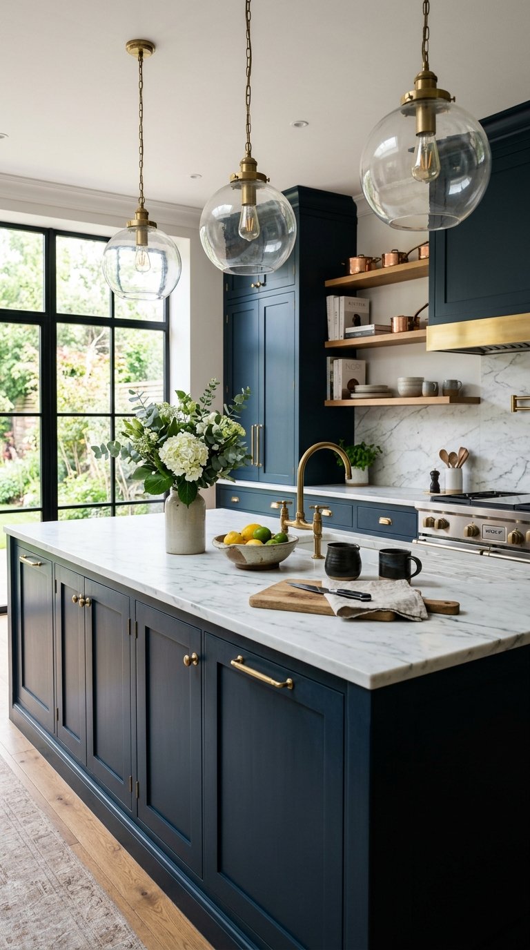
A midnight blue kitchen with brass hardware throughout is the most sophisticated kitchen color palette on this list, combining two tones that have appeared together in high-end residential design for centuries without either looking dated. The dark navy-to-near-black blue absorbs light and creates a moody, jewel-box kitchen quality that lighter palettes never achieve.
Benjamin Moore’s Van Deusen Blue or Sherwin Williams’ Naval hit the right midnight blue depth. Unlacquered brass hardware develops a natural patina over time that only improves the palette by adding depth variation at the cabinet face level. Pair with a light-toned countertop (white marble, light limestone, or cream quartz) to prevent the kitchen from reading as a sealed dark box.
8. Soft Yellow Cabinets With Grey-Green Walls
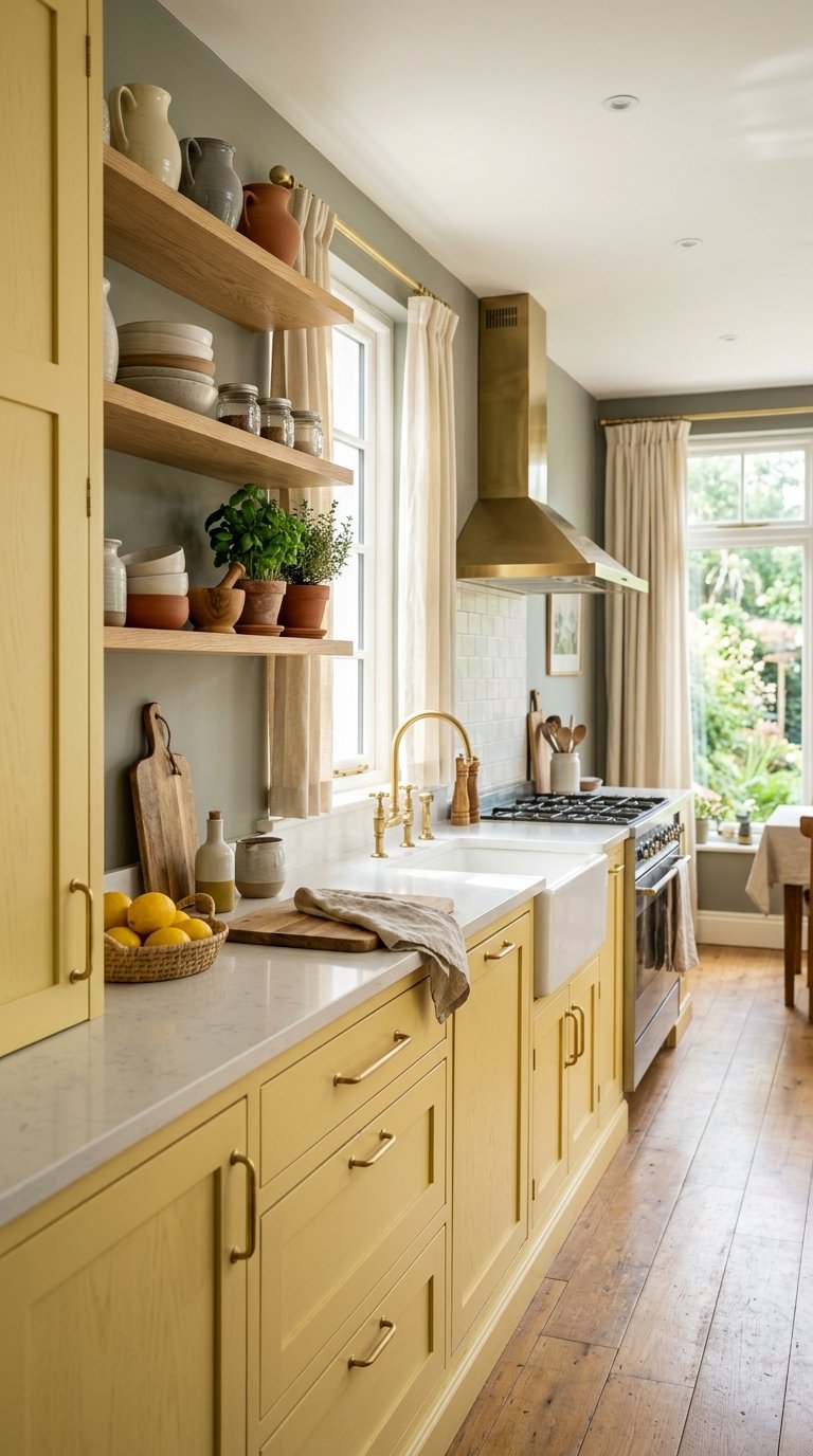
Soft yellow cabinets with grey-green walls create an unexpected but deeply satisfying complementary palette that feels like sunlight through foliage, which is a visual quality that keeps the kitchen energetic without being harsh. This palette works best in kitchens with significant natural light since it amplifies brightness rather than creating it.
Keep the yellow soft rather than saturated: Benjamin Moore’s Pale Moon or Sherwin Williams’ Butter Up avoid the school-bus yellow that reads as bold in a paint chip and overwhelming in a full kitchen. Grey-green walls in Farrow & Ball’s Mizzle or Sherwin Williams’ Evergreen Fog sit at the right muted green-grey to complement the yellow without competing with it.
9. Greige Cabinets With White Subway Tile and Dark Grout
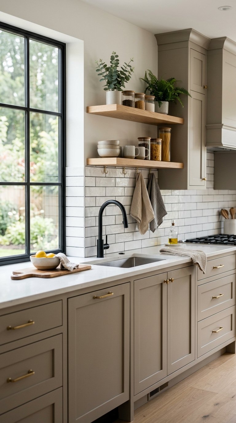
Greige cabinets with white subway tile and charcoal grout is the neutral palette that adds the most visual interest for the least commitment, since the dark grout lines on the tile create pattern and depth while the greige cabinet tone stays flexible enough to work with future hardware or countertop changes. This combination photographs beautifully in both warm and cool light.
Greige cabinet colors like Sherwin Williams Agreeable Grey, Benjamin Moore Revere Pewter, or Accessible Beige avoid the problem of grey that reads too blue in evening light and beige that reads too yellow in morning light, since both undermine the cabinet color’s relationship with the tile. The dark grout detail does the visual heavy lifting that makes this otherwise quiet palette feel designed.
10. Black Cabinets With Warm Wood Accents
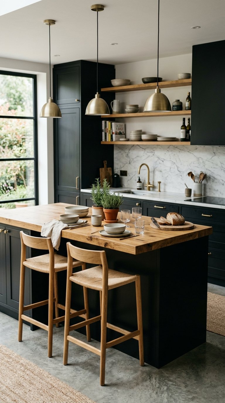
Black cabinets with warm wood accents create the most dramatic kitchen palette available within conventional design, and the warm wood prevents the all-black approach from reading as cold or austere. A black island with wood countertop, or black base cabinets with wood open shelving at upper level, both work as partial applications if full black feels like too much commitment.
Benjamin Moore’s Black Ink, Sherwin Williams Tricorn Black, and Farrow & Ball’s Off-Black are the three black paint choices that read warmest on cabinet surfaces rather than flattening into a void. The warm undertone in these specific blacks makes the cabinet faces readable in natural light rather than disappearing into silhouette, which is the problem cheaper pure-black paints create.
11. Dusty Blue Cabinets With Cream Countertops
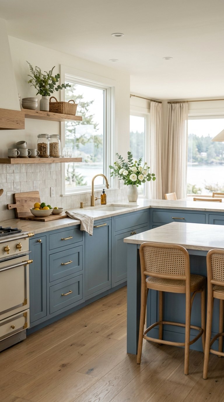
Dusty blue cabinets with cream countertops create a coastal-adjacent palette that works equally well inland when paired with warm wood tones and natural textiles rather than nautical accessories. The dusty, muted quality of the blue prevents it from reading as beachy in a context where that’s unwanted.
Benjamin Moore’s Newburyport Blue, Sherwin Williams’ Krypton, and Clare’s To the Moon hit the right dusty blue without pulling too green or too grey. Cream countertops in honed marble, travertine, or cream quartz warm the blue tone significantly and prevent the kitchen from reading as cold despite the blue palette’s inherent cool tendencies. FYI, this palette works best in kitchens where wood floors run through from an adjacent room, since the wood tone on the floor level adds the warmth the cabinet and countertop alone don’t provide.
12. Warm Beige Cabinets With Walnut Accents
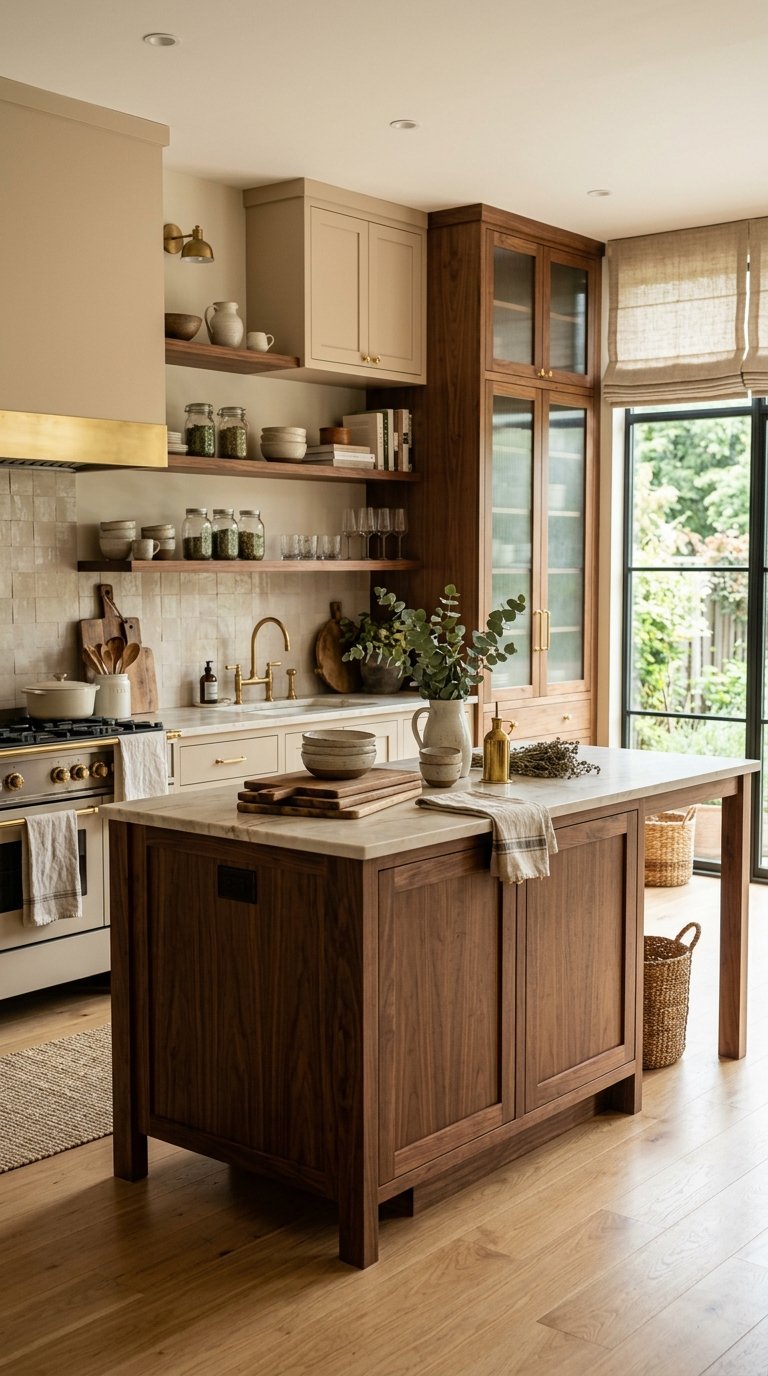
Warm beige cabinets with walnut wood accents create the most genuinely timeless kitchen palette on this list, since both tones appear in nature-derived materials that age and improve rather than date. The combination avoids every contemporary trend signal and reads as classically good rather than fashionably current.
Sherwin Williams’ Accessible Beige, Benjamin Moore’s Manchester Tan, and Farrow & Ball’s String all hit the warm beige register without pulling toward yellow or pink. Walnut wood appears in open shelving, a kitchen island top, floating shelves, or a bar area section where the rich dark brown grounds the warmer, lighter cabinet tone above the floor.
13. Olive Green Cabinets With White Walls and Brass Hardware
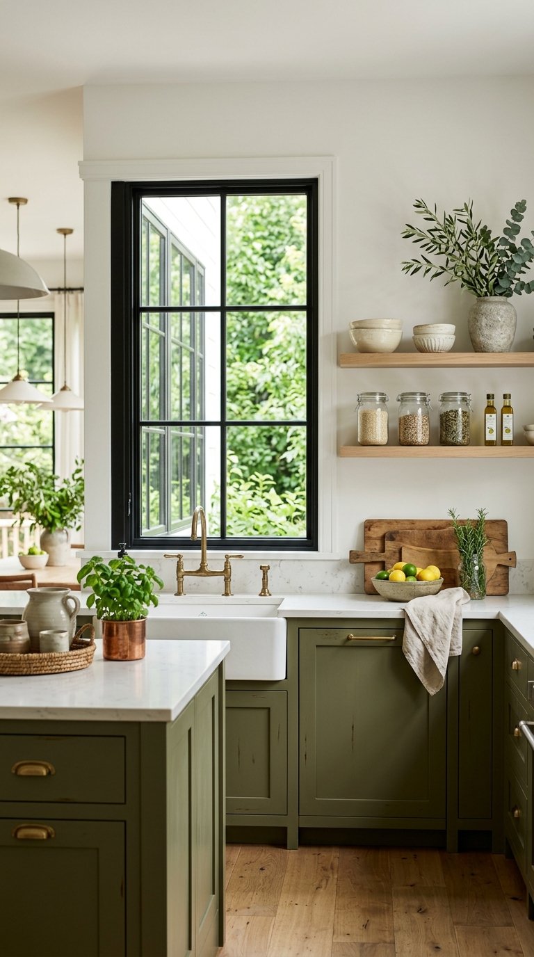
Olive green cabinets with white walls and brass hardware is the most popular kitchen color palette to emerge from the post-2020 renovation wave, and it earns that popularity because the combination of muted warm green, clean white, and warm metal hits three distinct visual notes without any single element overwhelming the others.
Sherwin Williams’ Oakmoss, Benjamin Moore’s Cedar Green, and Farrow & Ball’s Mizzle all sit in the right olive register. The white walls prevent the olive from dominating and keep the kitchen’s spatial quality open, while the brass hardware provides the warm metal note that ties the green and white together into a complete palette rather than two disconnected decisions.
14. Pink Cabinets With Warm White Walls
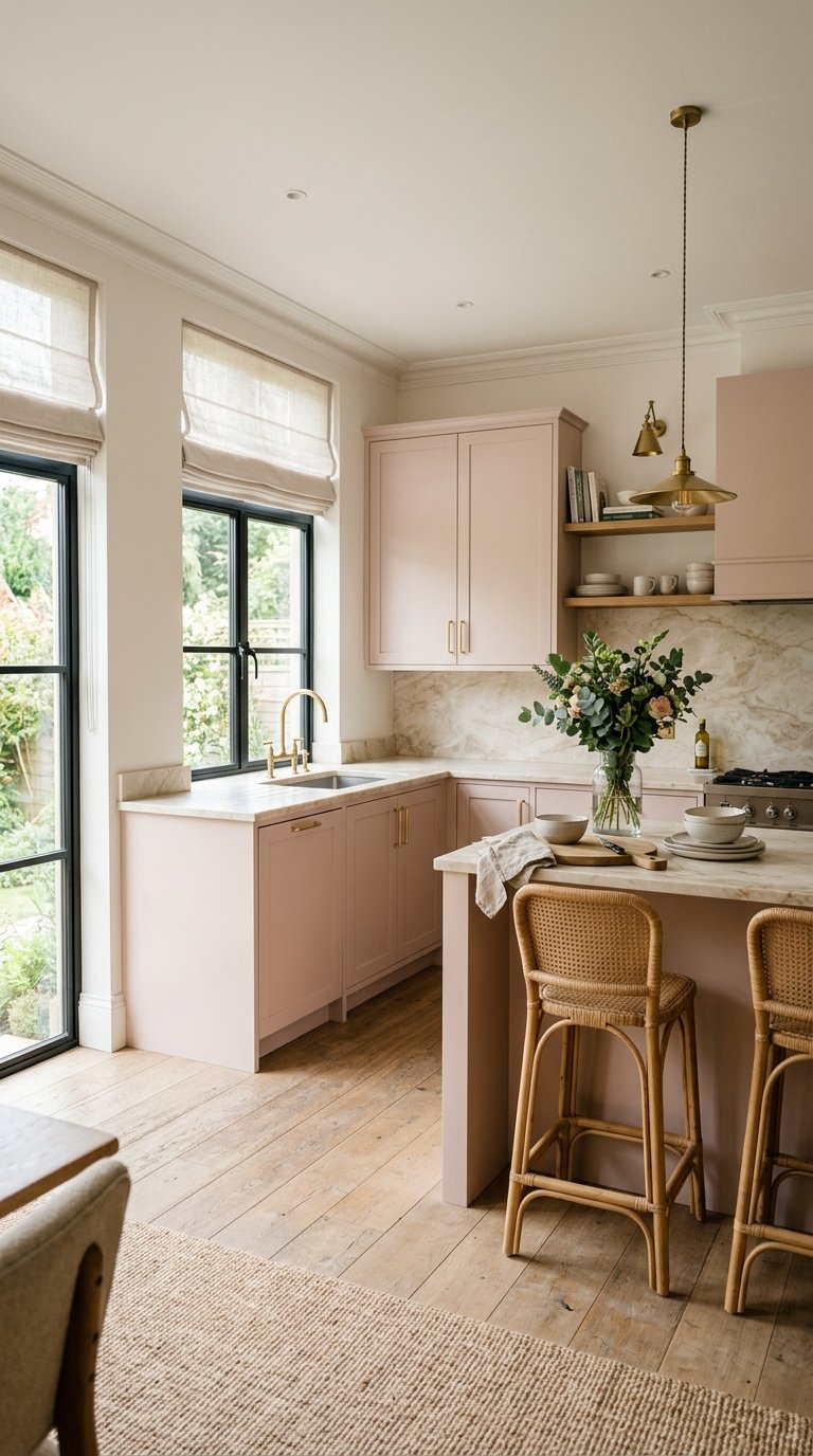
Pink kitchen cabinets work at a specific, muted register that most people underestimate until they see it in an actual kitchen, since the pale, barely-there blush versions read as sophisticated neutral rather than the bold statement the word “pink” implies. Farrow & Ball’s Setting Plaster on kitchen cabinets converts skeptics faster than any other paint choice in the pink family.
Pair muted pink cabinets with warm white walls (never cool white, which fights the warmth of pink immediately), polished nickel or brass hardware depending on whether you want a warmer or cooler accent, and a light marble or cream stone countertop. The palette photographs warmly in natural light and keeps the kitchen feeling soft and inviting rather than aggressively pink.
15. Deep Teal Cabinets With Light Grey Walls
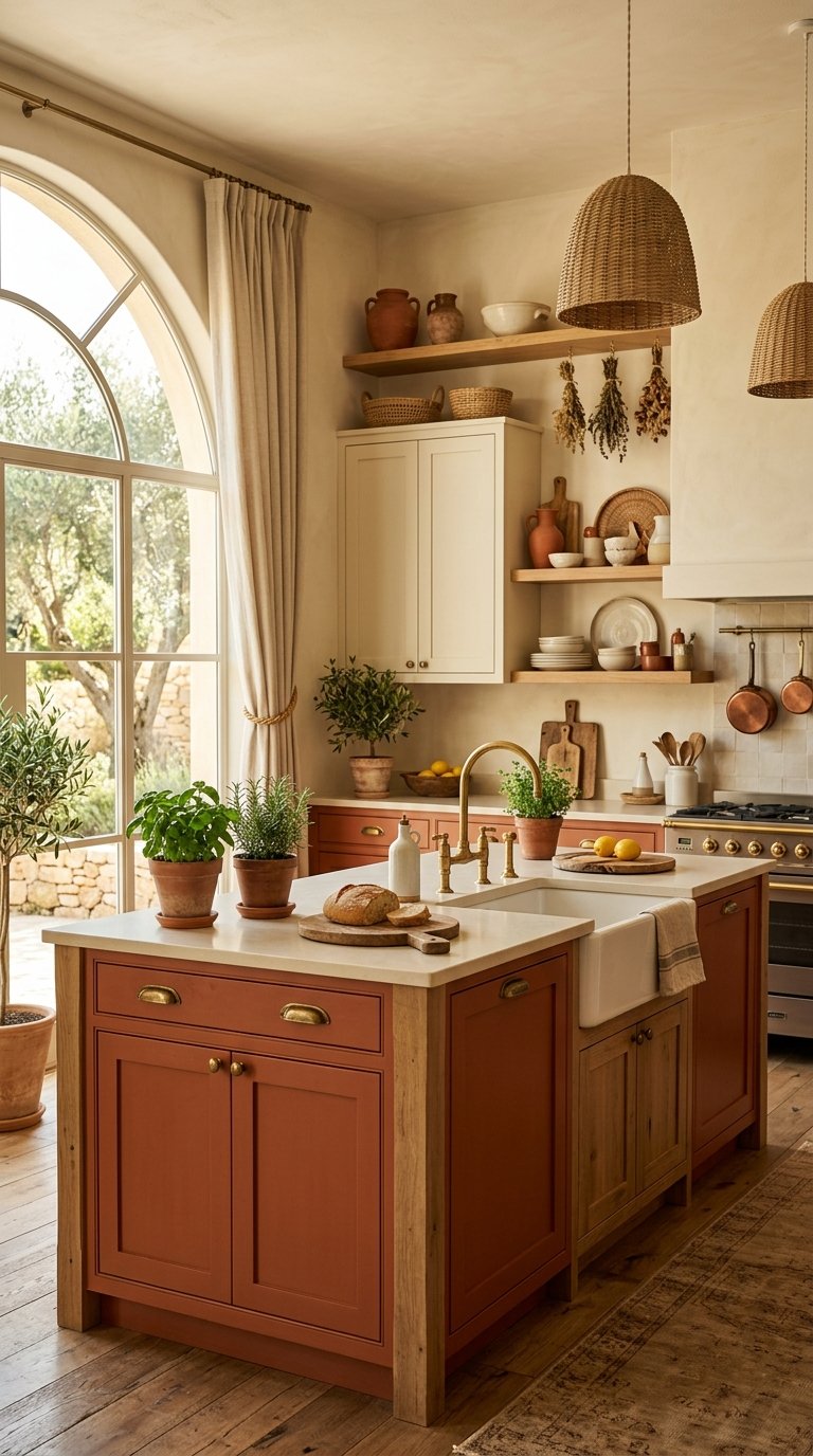
Deep teal cabinets with light grey walls combine a bold, saturated color with a neutral that lets it breathe without the white-on-teal contrast that can read as harsh in a full kitchen environment. The grey softens the visual impact of the teal while still receding enough to let the cabinet color dominate.
Sherwin Williams’ Oceanside, Benjamin Moore’s Mountain Lake, and Farrow & Ball’s Vardo all hit the right deep teal without pulling too blue or too green. Light grey walls in Sherwin Williams Repose Grey or Benjamin Moore’s Stonington Grey provide the right neutral backdrop. Add chrome or brushed nickel hardware rather than brass, since the cooler metal matches the teal’s cool undertone rather than fighting it.
16. Two-Tone Terracotta and Cream
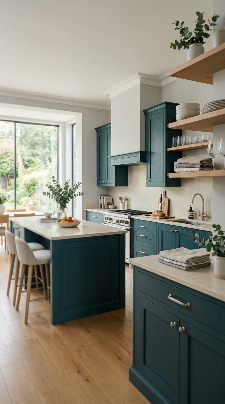
A two-tone kitchen with terracotta lower cabinets and cream upper cabinets delivers bold warmth at base level while maintaining the visual openness that keeps the upper zone from feeling heavy. The terracotta grounds the kitchen in an earthy, warm-toned base while the cream uppers reflect natural light and keep the palette bright.
Sherwin Williams’ Burnt Almond or Benjamin Moore’s Adobe Orange hit the right baked-earth terracotta for lower cabinets. Keep the cream on the upper cabinets in the warm yellow-cream register (BM White Dove, SW Alabaster) rather than a cool cream or off-white, since cool tones fight the warmth of terracotta rather than continuing it upward.
17. Sage and Terracotta With Natural Wood
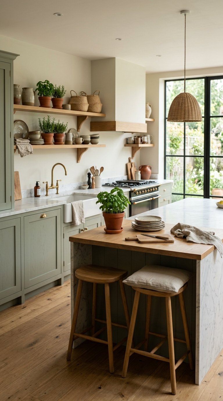
A three-tone palette of sage green, terracotta, and natural wood creates the most warmly layered kitchen color story on this list, combining cool green, warm earth, and natural material in a combination that reads as both collected and cohesive. This palette works best when the sage appears in cabinets, terracotta in accessories and textiles, and natural wood in open shelving or flooring.
Keep the sage muted (Sherwin Williams’ Retreat or BM’s Aganthus Green) so it reads as a warm neutral rather than a statement green. Introduce terracotta through ceramic accessories, pots, and small appliance colors rather than a paint choice, since this allows you to adjust the terracotta’s intensity without repainting.
18. Soft Black Kitchen With White Countertops
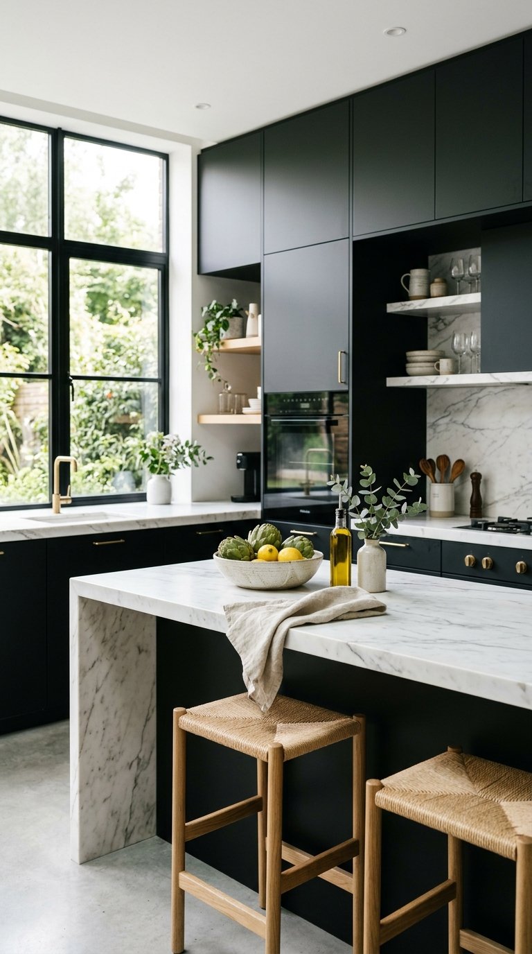
A soft black kitchen uses a near-black in a warm, slightly softened finish rather than a hard pure black, which prevents the kitchen from reading as cold while still delivering the dramatic dark enclosure that full black kitchens achieve. Soft black on all four walls and all cabinet faces with white countertops creates a graphic, minimal palette that works in modern, transitional, and industrial-adjacent kitchens.
Farrow & Ball’s Railings, Benjamin Moore’s Black Pepper, and Sherwin Williams’ Peppercorn all hit the right soft black register. White marble, white quartz, or honed white limestone countertops provide the relief that makes the dark kitchen readable at every light level rather than disappearing into darkness after sundown.
19. Warm Red Kitchen Accents With Neutral Base
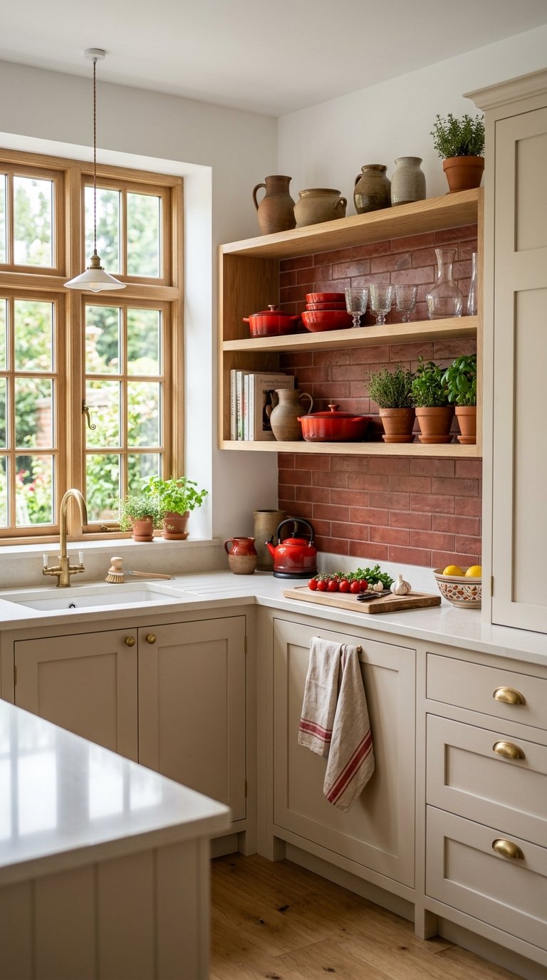
A warm red as an accent color in an otherwise neutral kitchen adds energy and personality without the full commitment of red cabinet faces, which dramatically narrows the resale appeal and future flexibility of the space. Red as a backsplash tile, a kitchen island color, or an accent wall behind open shelving delivers color impact at a contained scope.
Benjamin Moore’s Heritage Red or Sherwin Williams’ Antique Red hit the warm, brick-adjacent register that reads as sophisticated rather than loud. Pair with cream or warm white cabinet faces, natural wood or dark stone countertops, and let the red work as the accent that gives the whole neutral palette its identity and energy.
20. Lavender Kitchen With White Cabinets
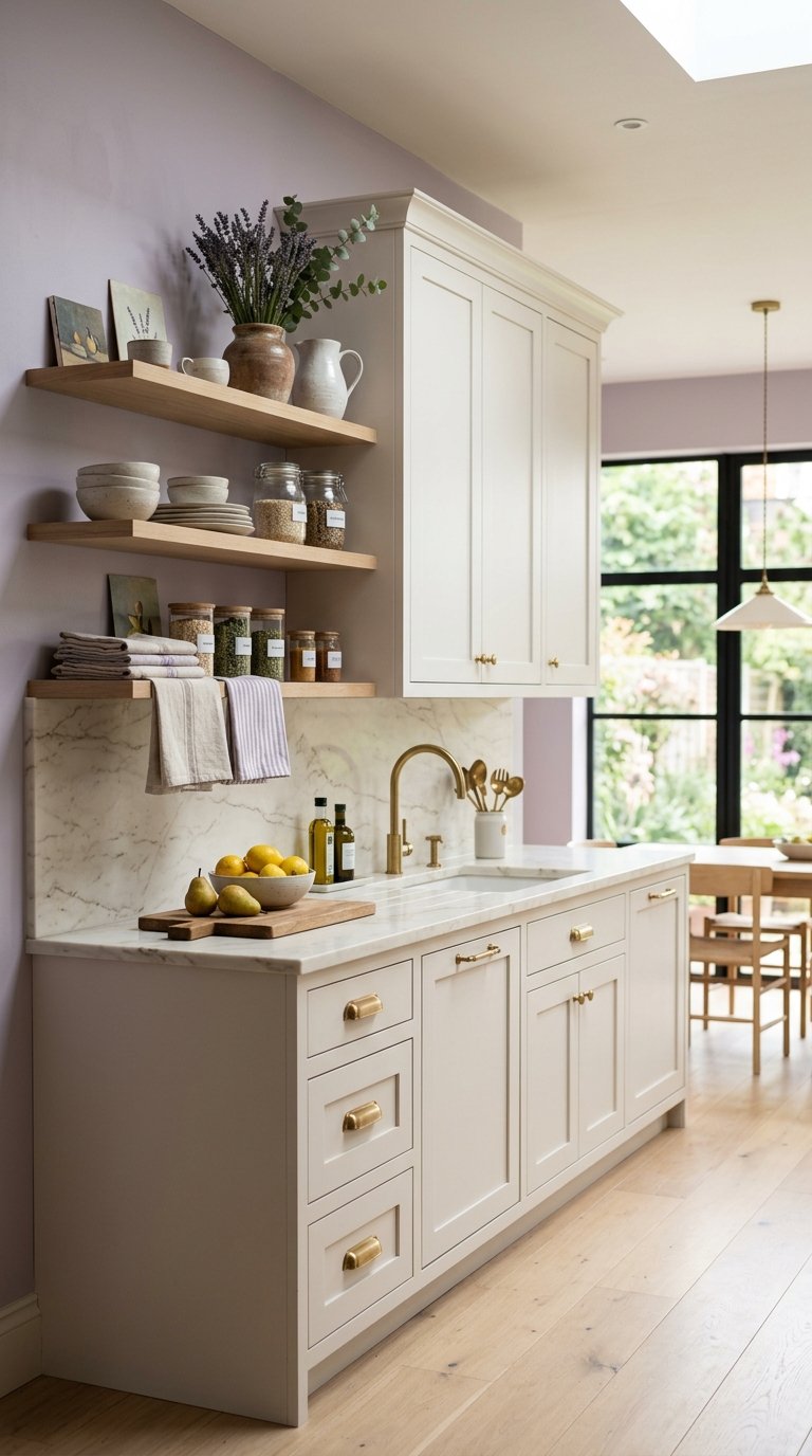
Lavender kitchen walls with white cabinets is the unexpected palette that consistently surprises people who see it in person, since the pale, muted lavender reads warmer and more grounded in an actual room than any paint chip suggests. The white cabinets keep the space bright while the lavender walls add color personality without dominance.
Benjamin Moore’s Misty Lilac or Sherwin Williams’ Violet Mist hit the muted lavender register that works in a kitchen context. Keep hardware in brushed brass or warm nickel to prevent the palette from pulling too cool, since silver hardware amplifies the cooler lavender undertones while warm metals ground it toward the purple-grey territory that reads as sophisticated rather than pastel.
21. Charcoal Kitchen With Warm Wood Island
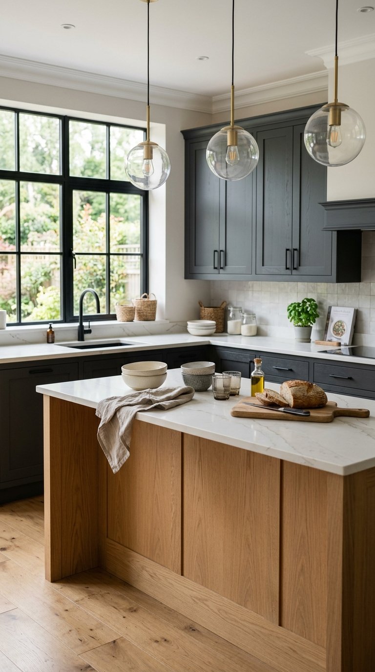
A charcoal grey kitchen with a warm wood island creates a two-zone palette that uses the wood’s warmth as a deliberate counterpoint to the cool grey’s sophistication. The kitchen reads as modern and restrained while the island reads as warm and inviting, and the contrast between the two zones makes the island a natural gathering point.
Sherwin Williams’ Peppercorn or Benjamin Moore’s Kendall Charcoal on perimeter cabinets gives the right depth without the full drama of true black. White oak, walnut, or butcher block on the island countertop provides the warmth contrast. Add warm white walls to keep the kitchen spatially open, since charcoal cabinets with a dark wall tone closes in even large kitchens visually.
22. White and Gold Kitchen Palette
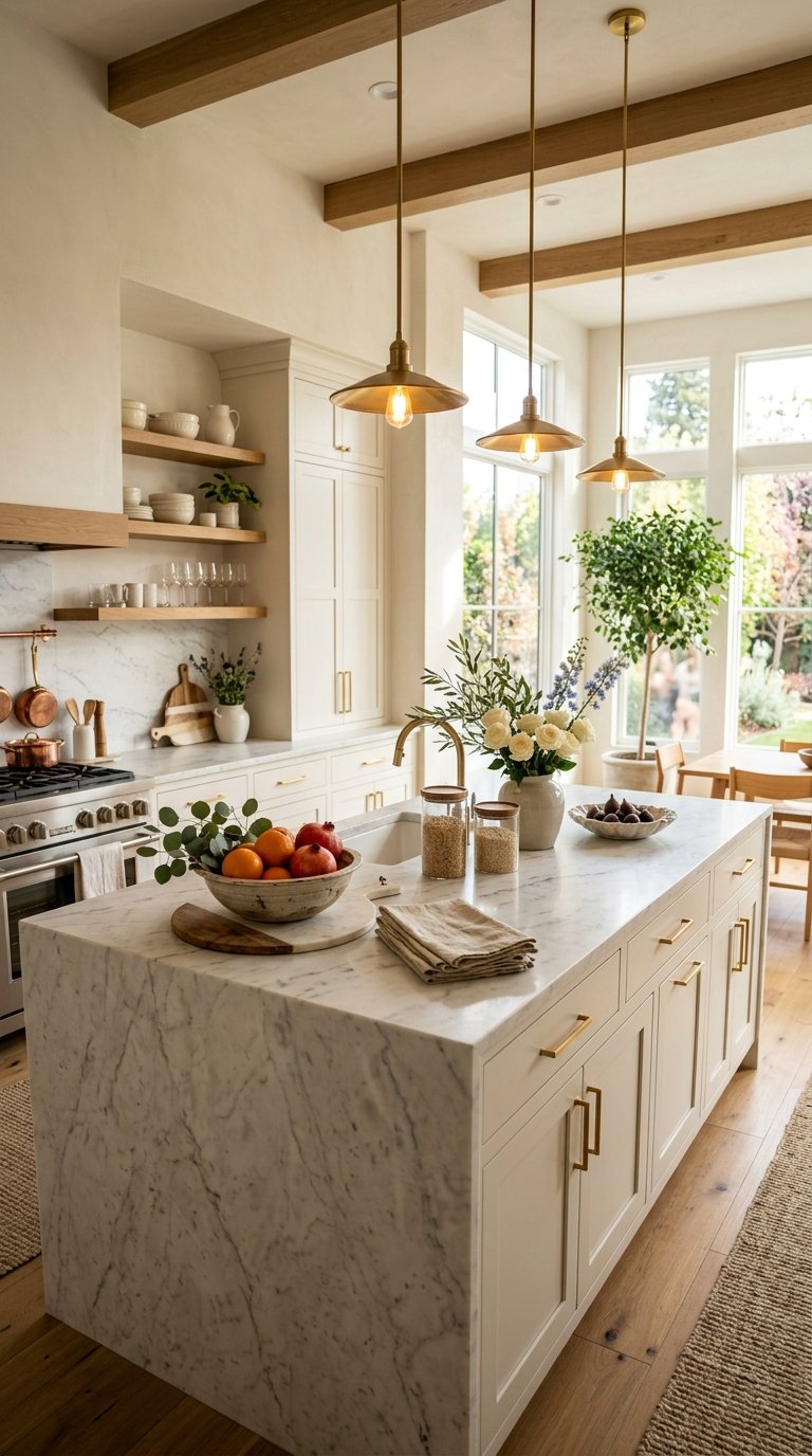
White cabinets with gold hardware and warm gold or honey-toned wood accents create a kitchen palette that reads as luxurious without a single expensive material, since the gold tone in the hardware, light fixtures, and wood accents does the visual work that marble or custom cabinetry does in more expensive versions of the same look.
Brushed gold hardware from Rejuvenation, Wayfair, or Amazon runs $8 to $20 per pull, and updating a full kitchen costs $150 to $400 in hardware alone. Pair with warm white cabinets (BM White Dove or SW Alabaster), honey-toned wood floating shelves, and a warm white or cream countertop. The gold thread running through hardware, lighting, and accessories ties everything together into a complete palette rather than a collection of white decisions.
23. Black, White, and Warm Wood Three-Tone Palette
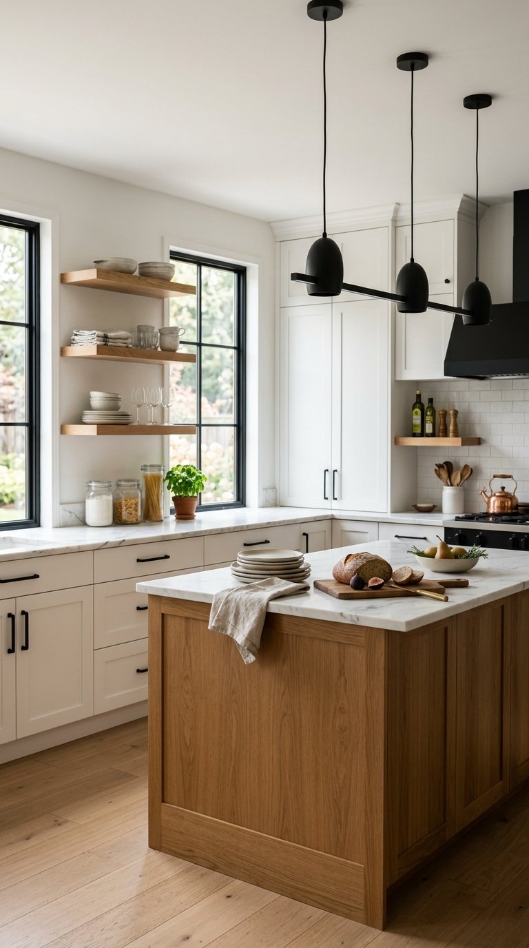
The black, white, and warm wood three-tone kitchen palette is the most versatile combination on this list because it works across modern, farmhouse, Scandinavian, and transitional kitchen styles without stylistic adjustment, since all three tones appear in every design tradition in some form. Black and white provide the graphic contrast, warm wood provides the warmth that makes the graphic combination livable.
Apply black on hardware, faucets, and light fixtures. Apply white on cabinet faces and walls. Apply warm wood on open shelving, flooring, or a kitchen island countertop. The three elements create a complete palette in which each tone has a specific role, and the result reads as designed rather than decided upon by committee. IMO, this is the palette to choose if you want a kitchen that photographs well, ages well, and sells well, since all three tones hold their appeal across market cycles and buyer preferences 🙂
Final Thoughts
Kitchen color palette decisions work best when they start from the undertone level rather than the color level, since two whites or two greys can create completely different rooms depending on whether their undertones pull warm or cool. Identify your kitchen’s natural light quality first, since north-facing kitchens need warm-undertone palettes to compensate and south-facing kitchens handle cooler tones more gracefully. Pick one idea from this list that solves a specific problem in your kitchen right now, whether that’s too much visual flatness, too much cold white, or no personality at all, and start there. Your kitchen doesn’t need a magazine renovation to have a great color palette. It needs one well-made decision applied with consistency.